
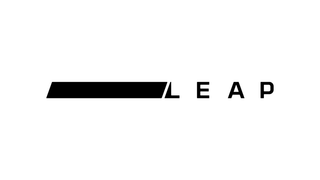
Primary Brandmark - Rollover and click to download logo pack
Brand Use
Please ensure these components are downloaded from the approved sources and never recreated in any manner – unless specified otherwise – for example for new graphic illustrations.
Brandmark Versions
The following are the approved brandmarks for use across the entire Leap brand.
Brandmarks should never be modified and always appear in proportion, following the minimum clear space rules whenever possible.
There are two key variants of the brandmark for both English and Arabic, and a single brand icon that can be used independent of the full brandmark.
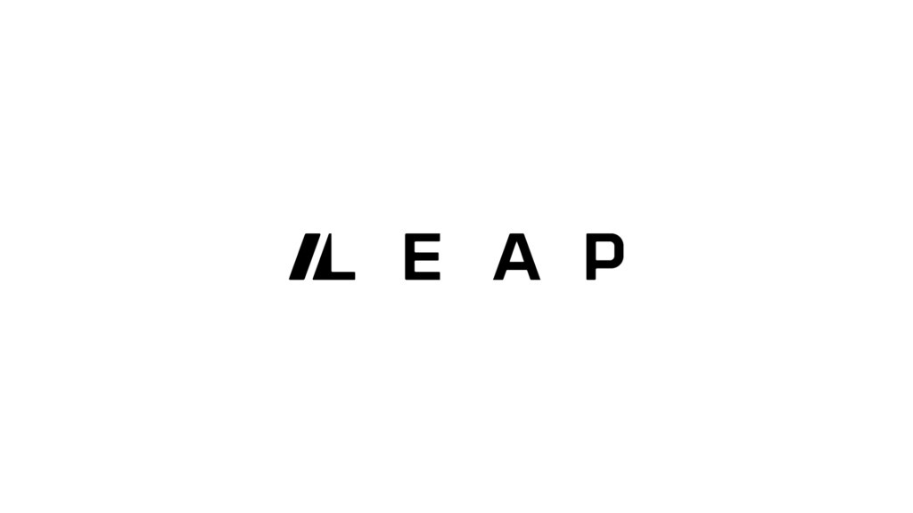
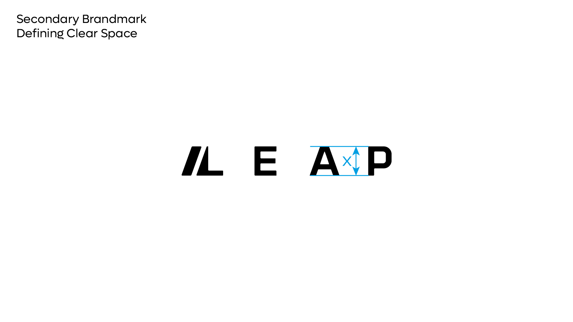
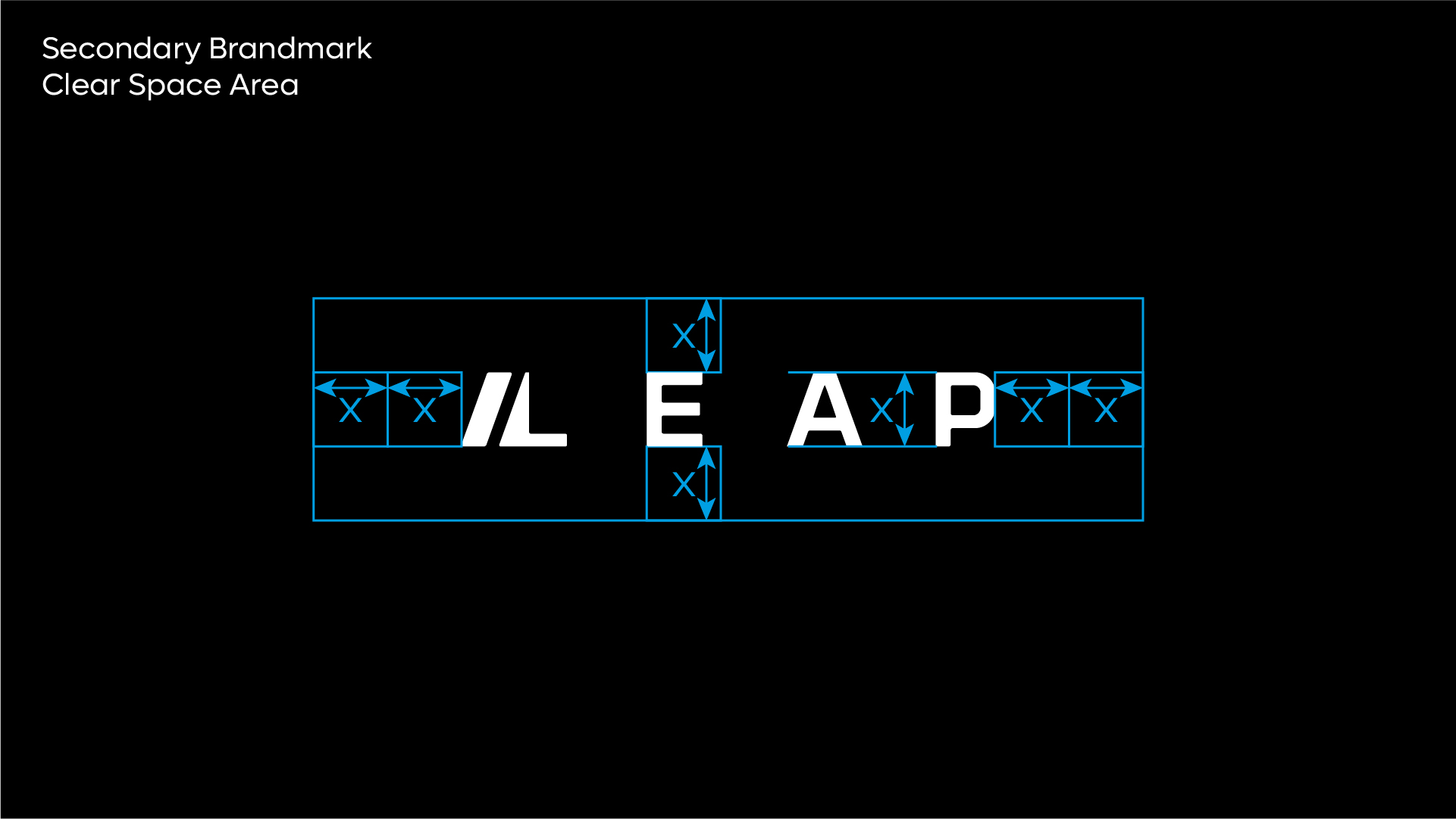
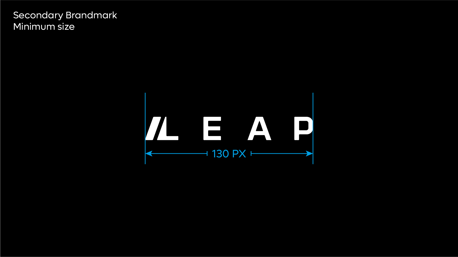
Secondary Brandmark - Rollover and click to download logo pack
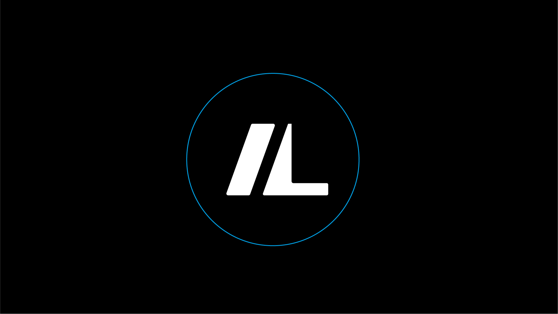
Brand / Fav Icon
The Leap icon can be used independent of the full brandmark across all applications. This can be implemented over time as brand recognition increases. The Leap icon should NEVER be modified in any manner.
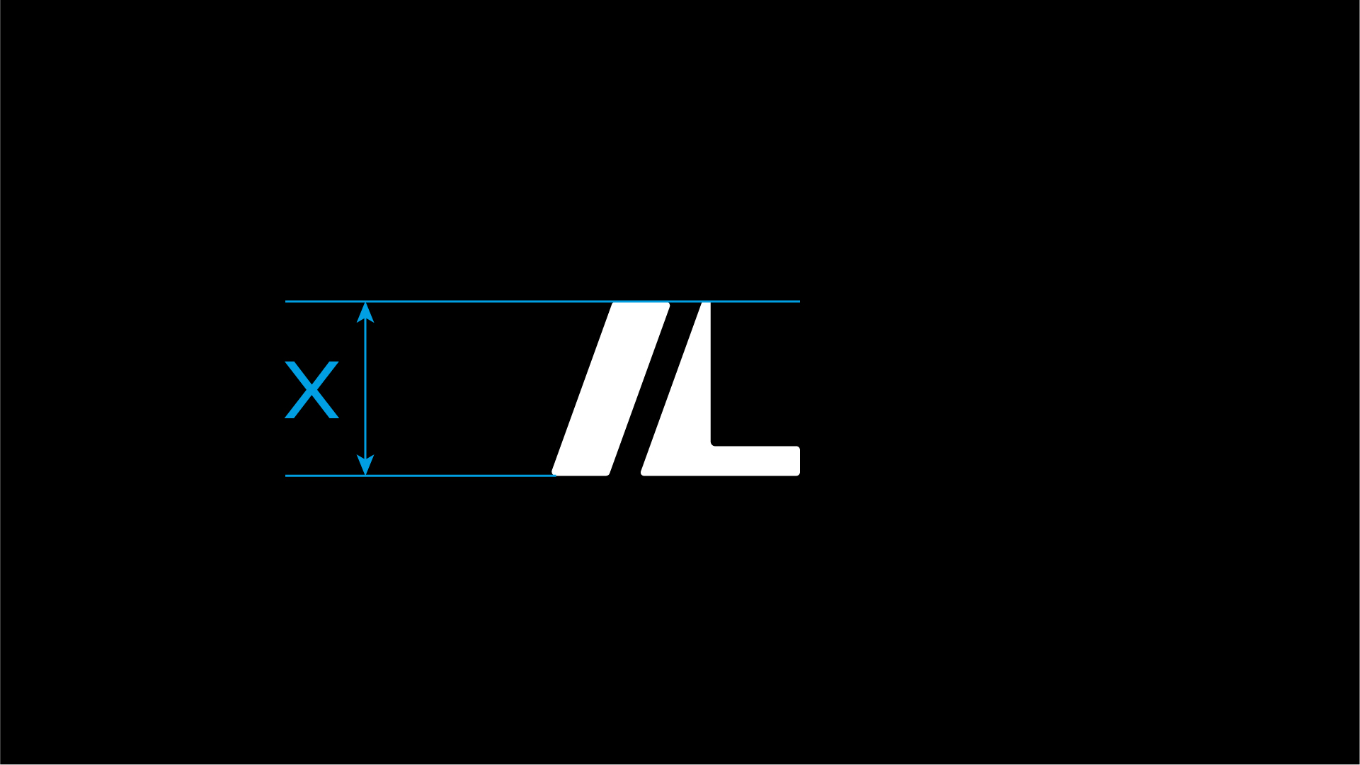
Clear Space
Minimum space rules varies slightly for the brand icon – with the right hand side of the icon requiring less clear space. This ensures the icon is visually balanced within a crop.
The clear space rules can be disregarded when using in digital applications and it is being featured as fav icon or profile image.
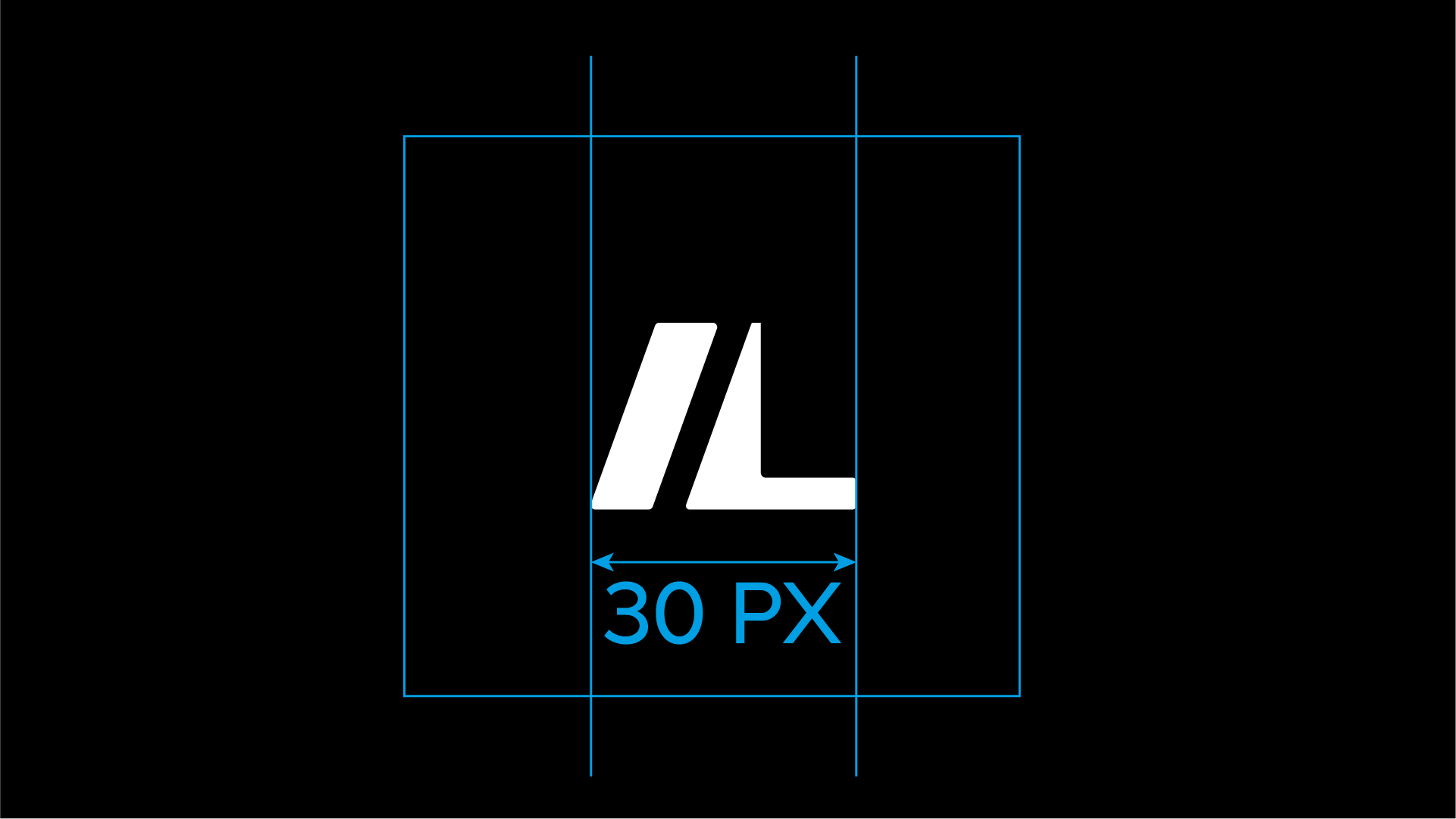
Minimum Size
The minimum width for the icon is set at 30px on a 227dpi size screen and should never be featured at a smaller size. This ensures the legibility of the brand icon is always maintained.
Usage
The brand icon should be avoided being over used, and not feature in the same substrate or screen wherever the full brandmark is featured.
In digital applications, both brandmark and brand symbol use should be avoided whenever possible – unless it is a function of a particular application. For example the icon featuring in the browser bar, with the full brandmark featured on the website.

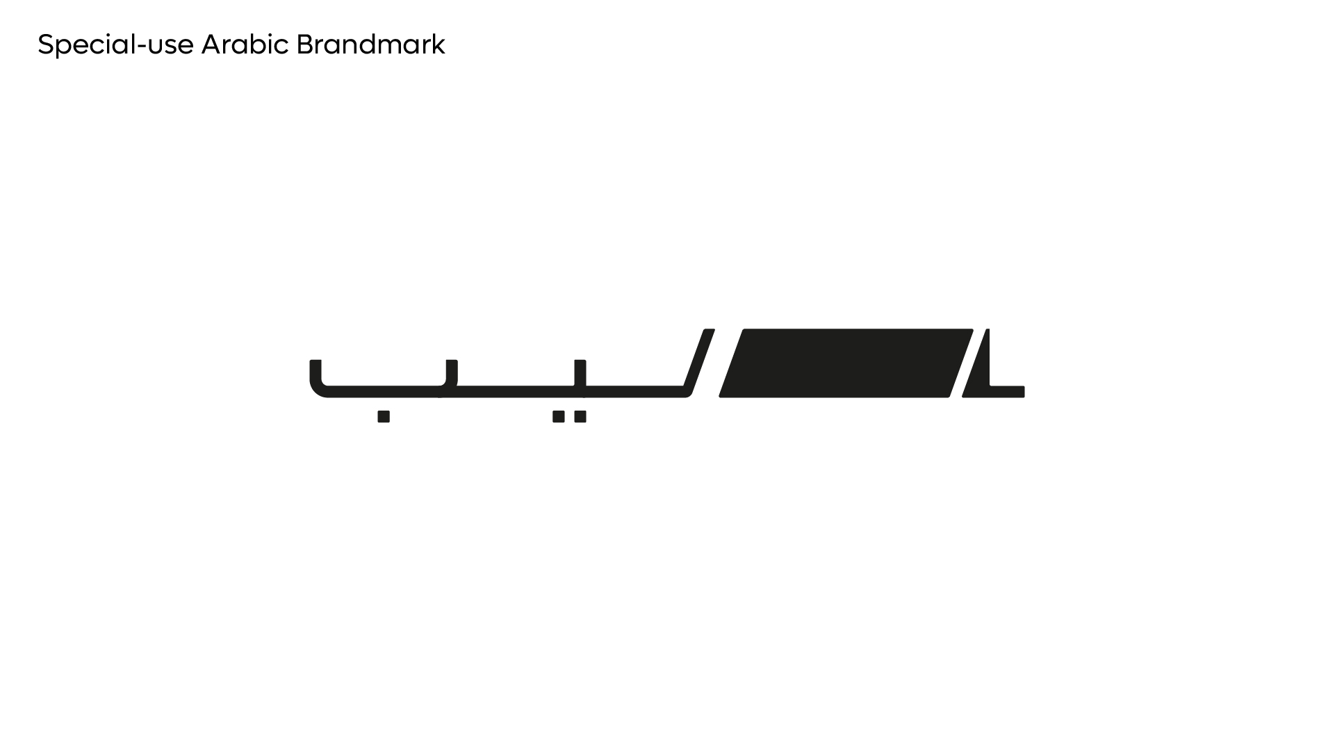
Special Use Brandmark - Arabic
The following Arabic variant of the brandmark should ONLY be used IF and when required from a legal or administration perspective and NEVER internationally.
The Arabic brandmark can also be considered for use in exceptional circumstances on dedicated VVIP arabic only communication – such as an invite to special event.
However whenever possible the Latin brandmark should always be the default brandmark of choice to use.
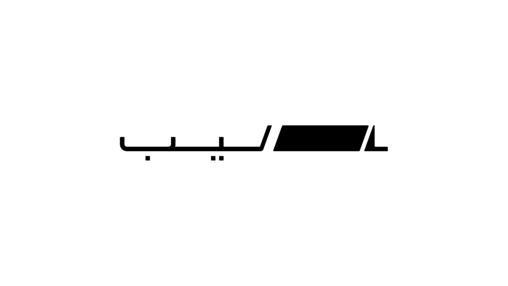
Primary Arabic Brandmark
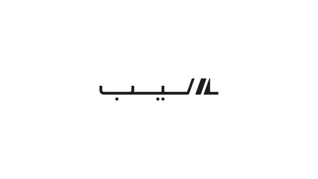
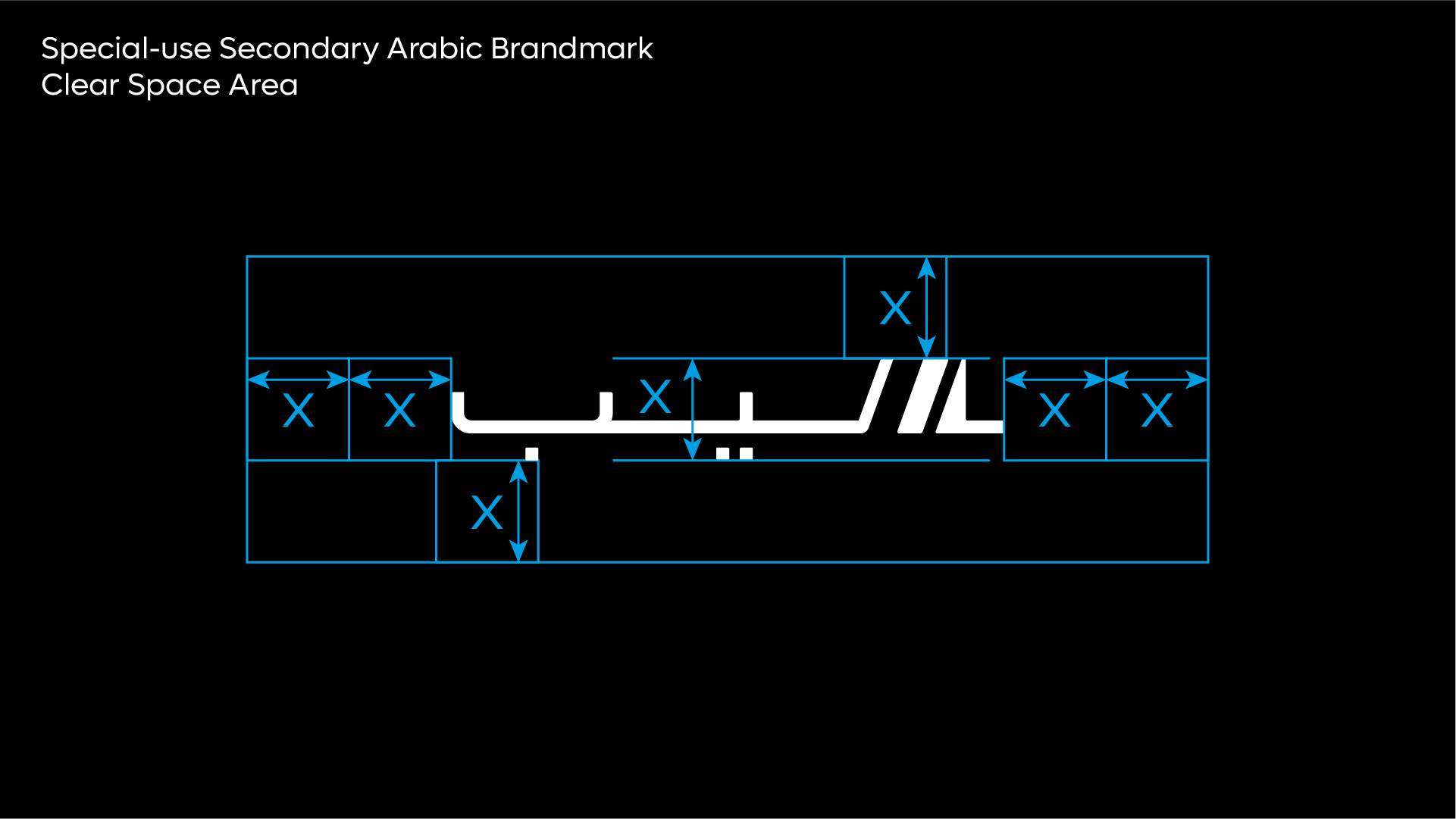
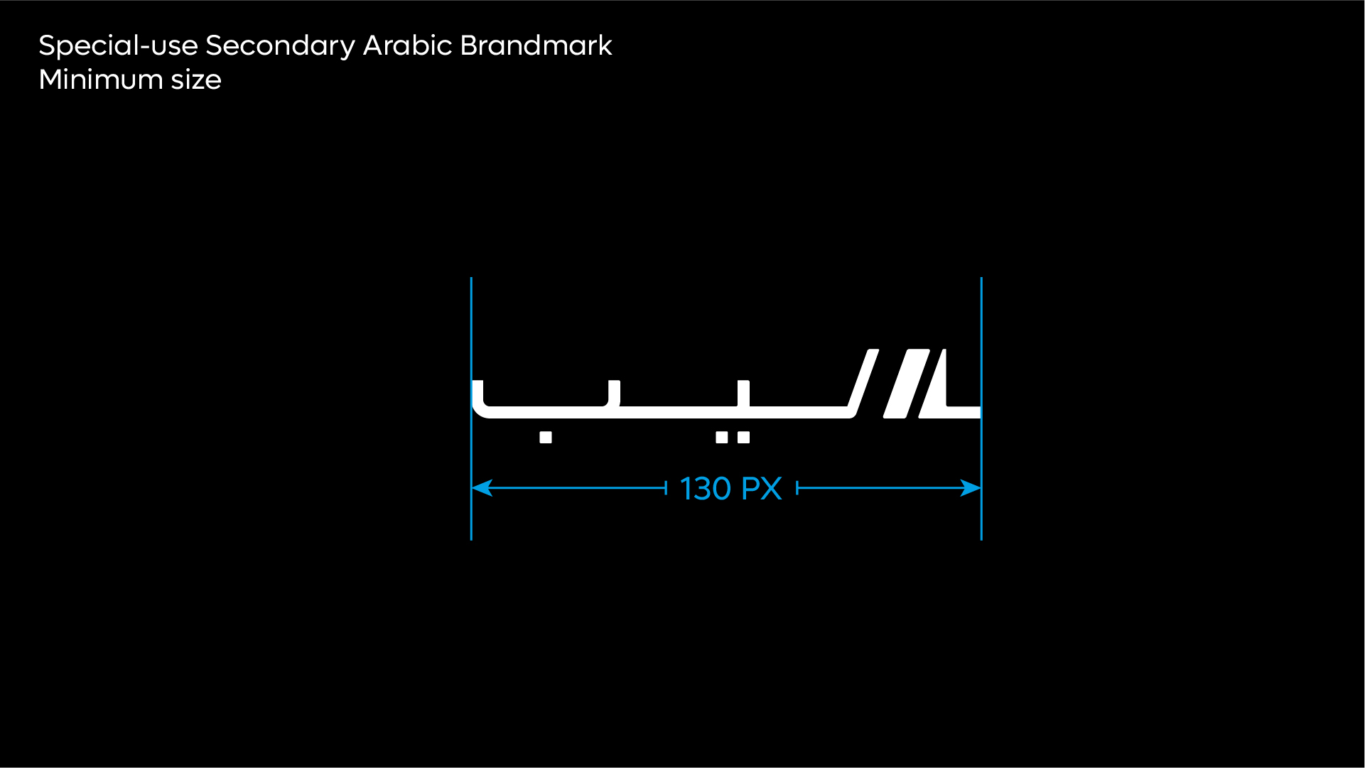
Secondary Arabic Brandmark
Usage Rules
Clear Space
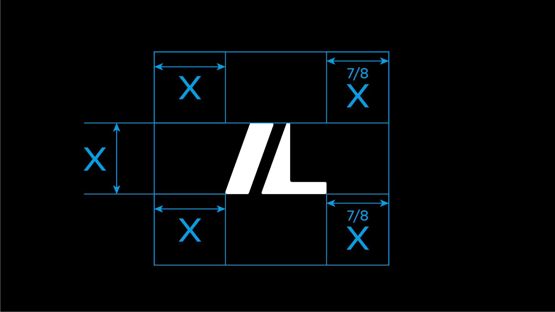
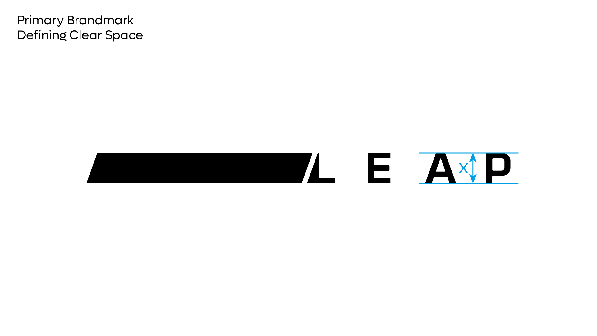
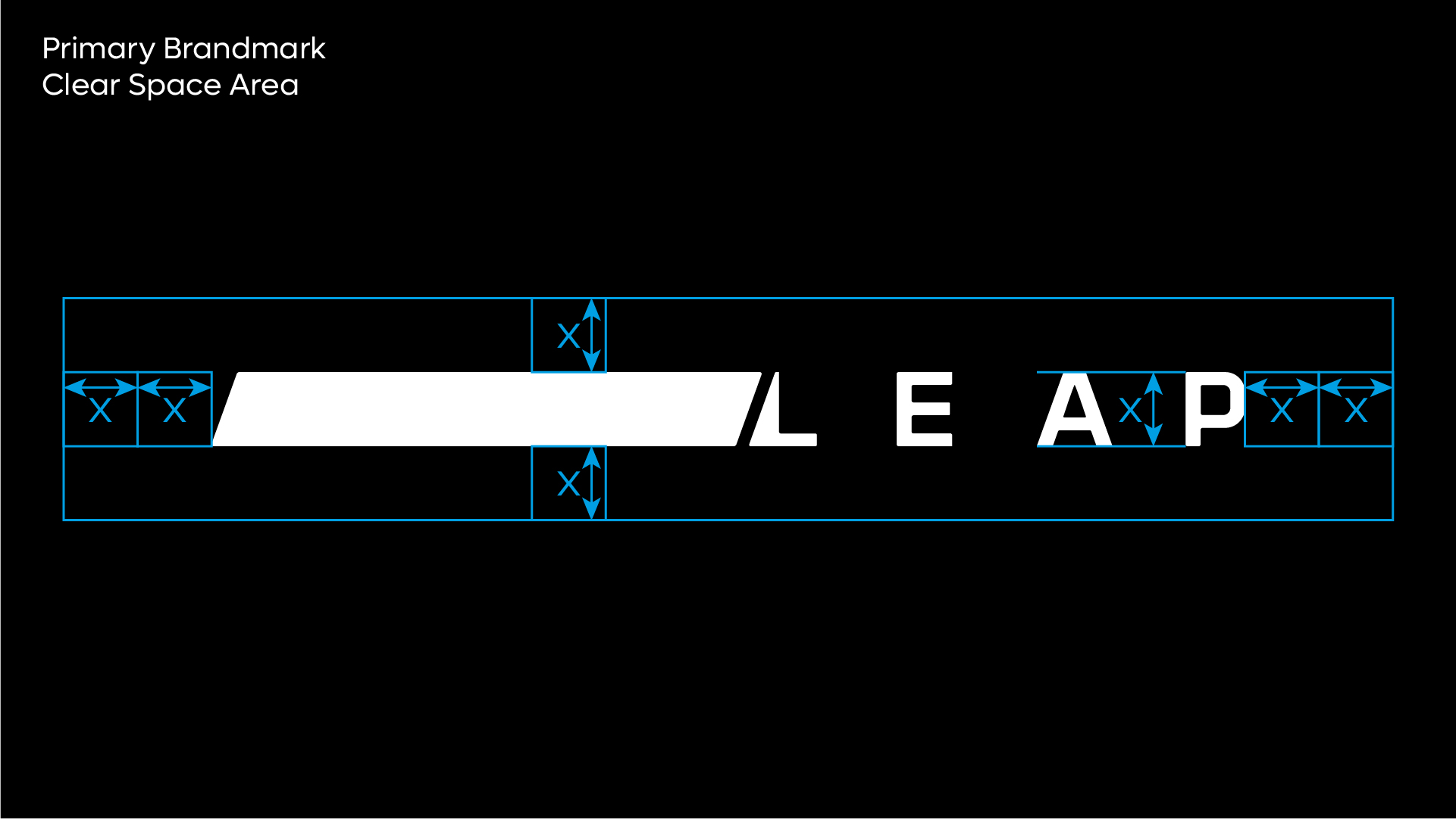
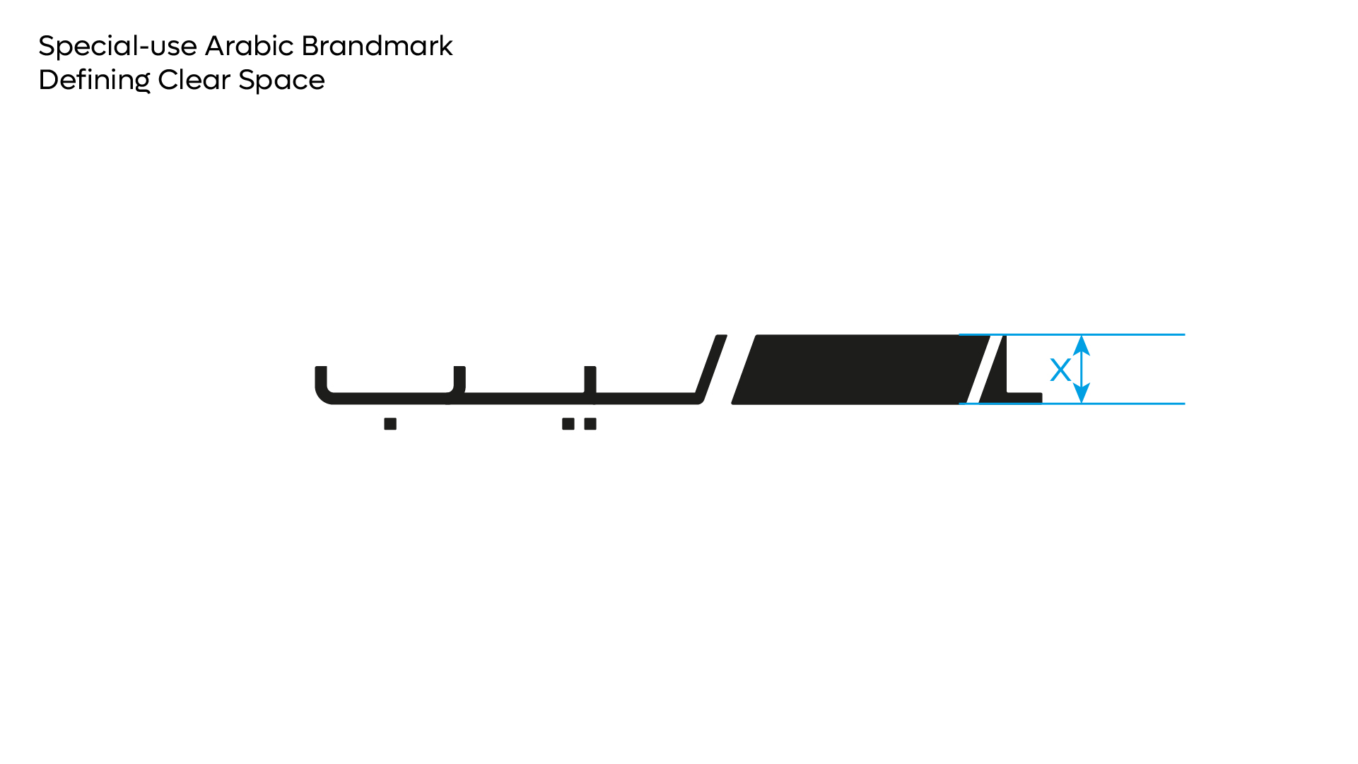
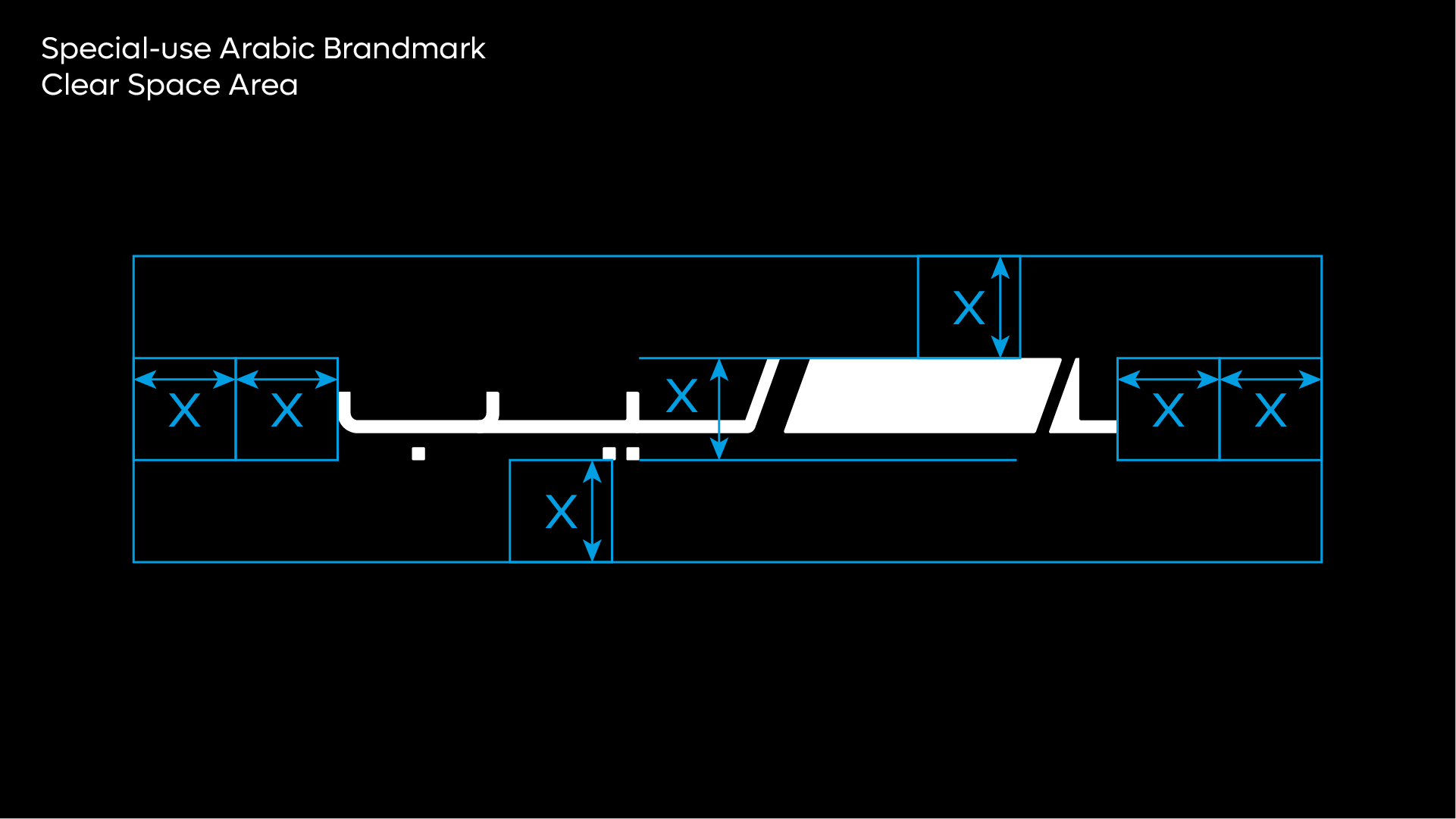
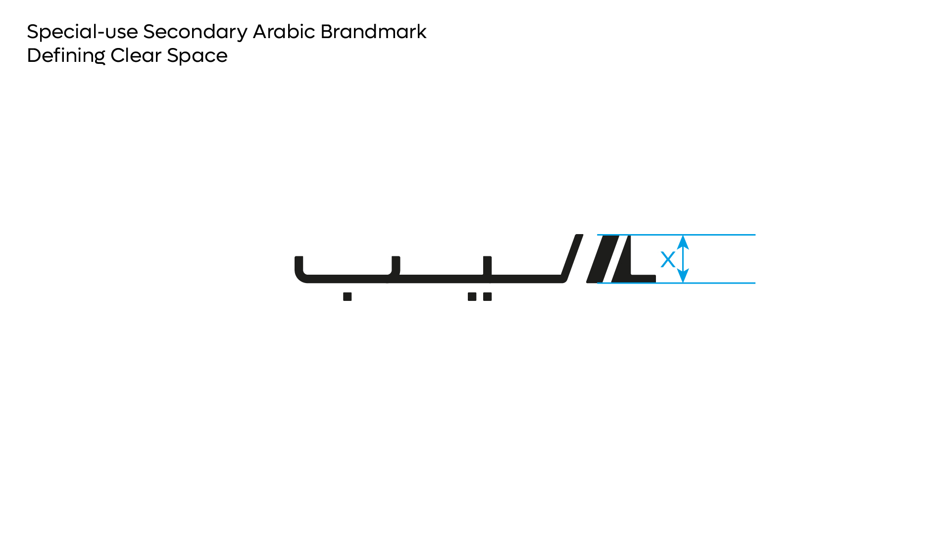
Clear space is equal to the x-height of the LEAP wordmark and should be adhered to strictly whenever possible. The following is breakdown of the clear space required around each brandmark variant.
Defining Clear Space
1. The x-height of the brandmark is used to determine the clear space.
2. The clear space at top and bottom of the brandmark is equal to a x1 x-height.
3. The clear space at left and right of the brandmark is equal to a x2 x-height.
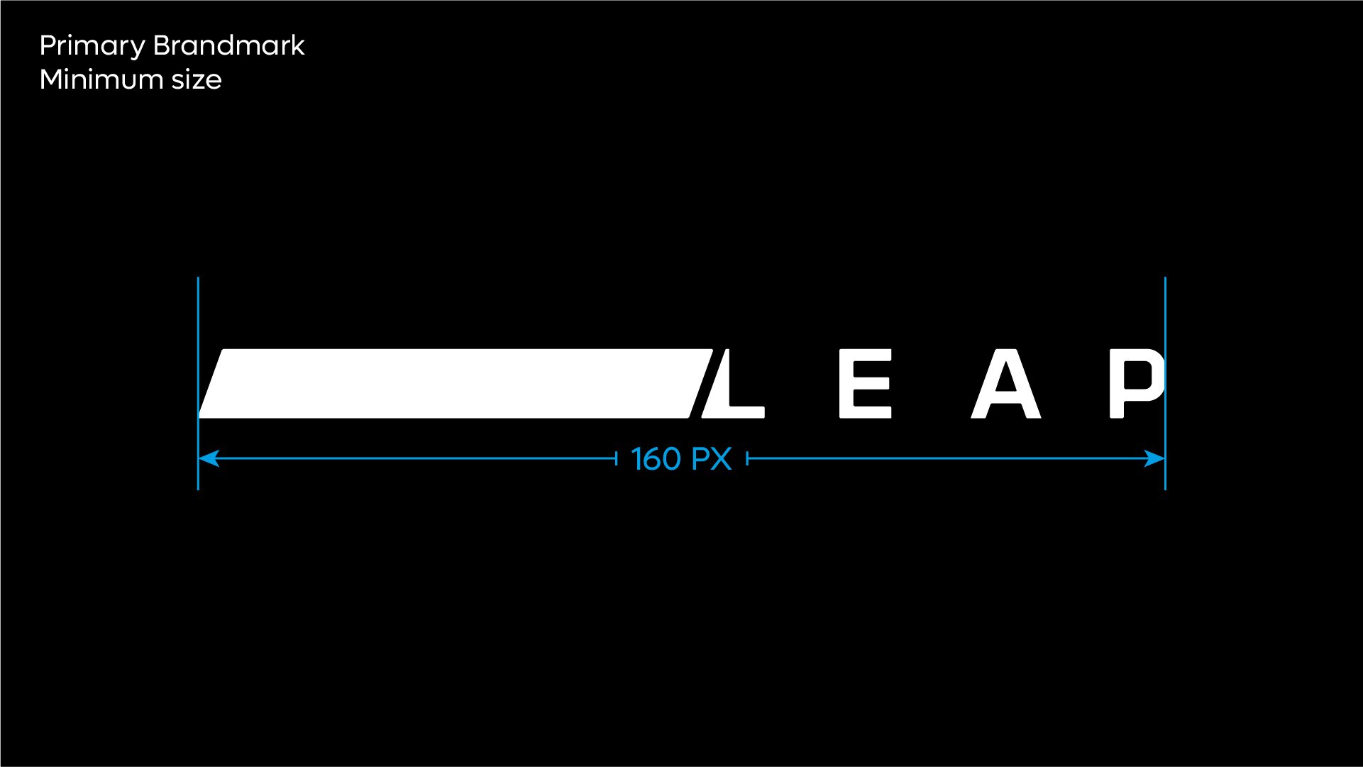
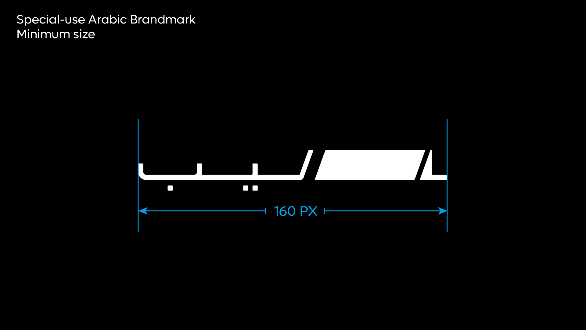
Minimum Size
The minimum size rules should be adhered to strictly. This will ensure the Leap brandmark is always legible across all applications. Visuals not shown to scale.
Colour Versions
There are two colour variants of the brandmark.
The primary brandmark should always be implemented in the full black colour variant. This should be used across all physical and real world applications such as printed collateral, signage, and architectural applications.
Â
Usage: Latin Brandmark
Usage: Arabic Brandmark
Brandmark Usage
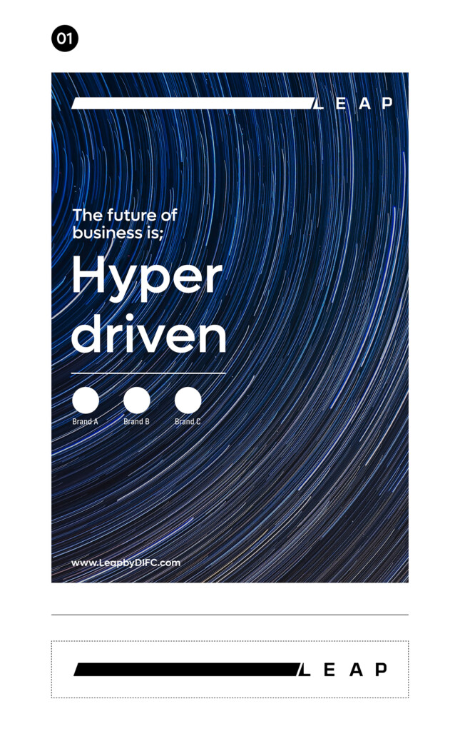
The Leap brandmark has been designed to adjust and adapt to every application, giving it a distinctive personality and a sense of hyper driven energy, signifying how business in the modern world is all about change and adaptation at speed.
Below are a few examples of how the brand can adapt to its application – independent of the medium it is used within.
Shown here are examples of how the Leap brandmark can adapt to different application sizes and formats.
General usage rules
1. The Leap brandmark when possible should appear at the top of all applications
2. The Leap brandmark should be adjusted to span the width of the application (while maintaining the clear space rules).
3. The Leap brandmark should be extended manually – but it is essential that care is taken when increasing the width, ensuring the curved corners and angles are maintained strictly.
4. The Leap brandmark should only be extended to a level that ensure the wordmark is always clear and legible at a comfortable distance.
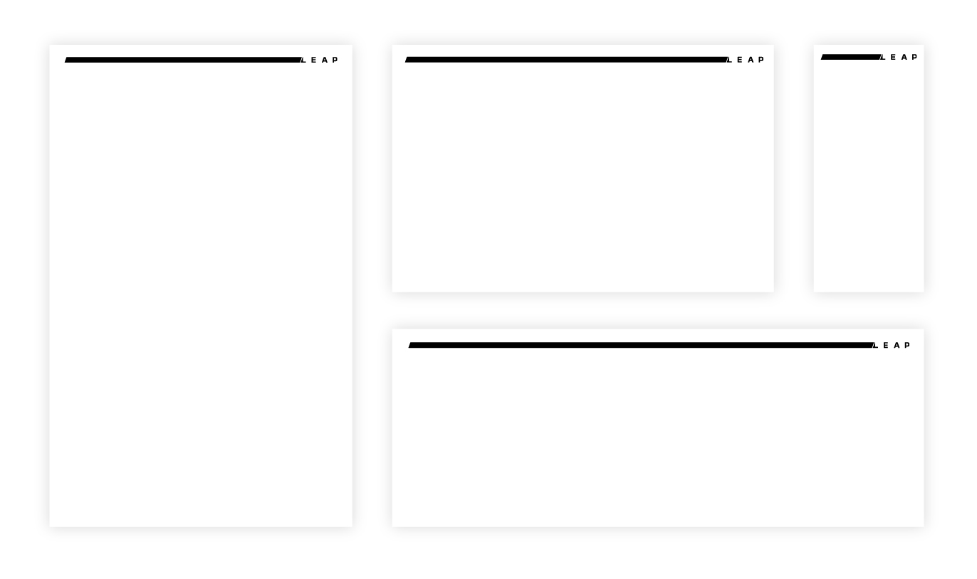
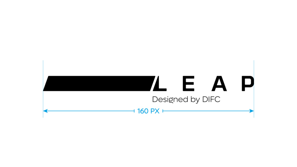
Brandmark with extension
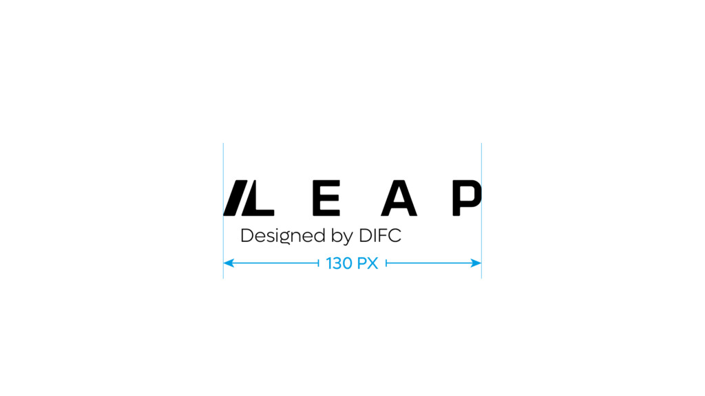
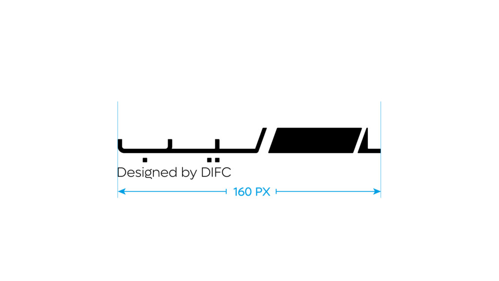
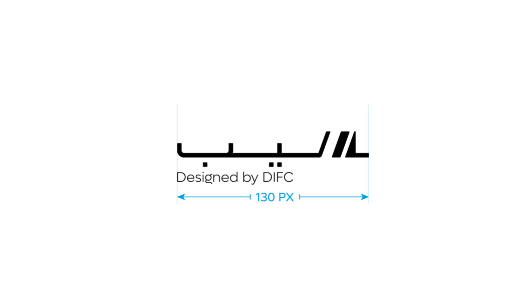
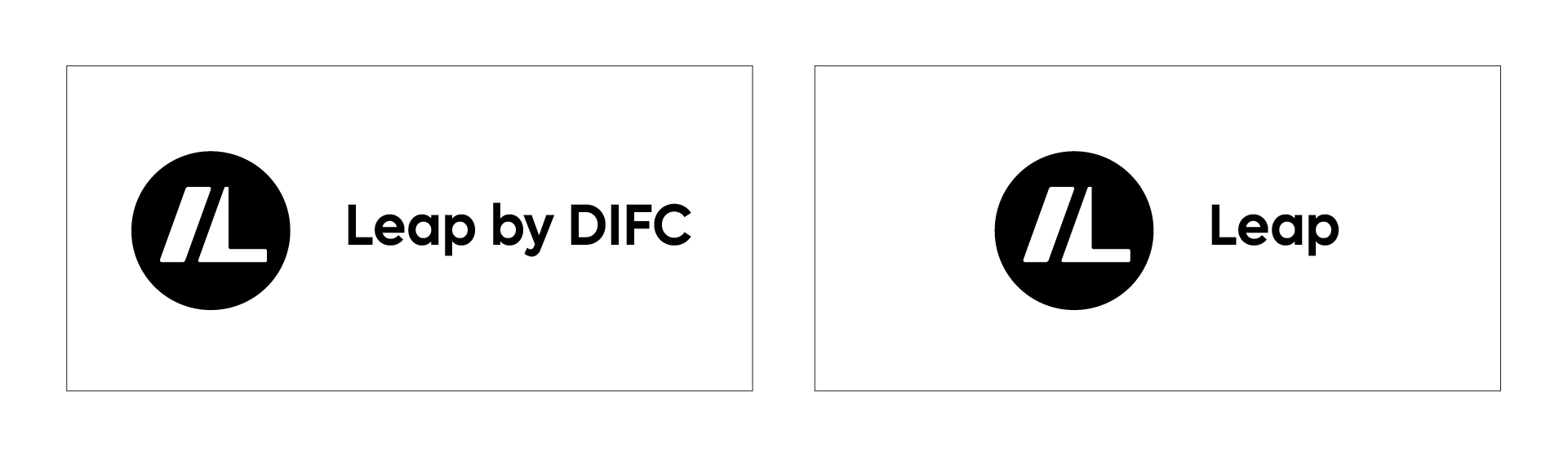
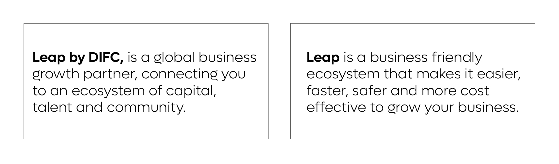
The Leap brandmark is also available with an extension that indicates the Leap as a product designed by DIFC. These variants can be used across the all communications – and should be used leverage Leap by utilising the brand equity of DIFC.
These variants function in the same manner as the primary Leap brandmark using the same rules and guides as shown previously.
Co-Branding
The following are the basic principles when utilising the Leap brand together with partner brands.
There are three specific hierarchies that the brand can be used with external brands.
- Leap as the primary brand with partner brands playing a secondary role.
- Leap brand with equal weighting with the primary brand.
- The Leap brand featured in communications of another brand.
These principles apply all brand executions, across events, digital applications and marketing comms.
Primary brandmark should be used when the Leap brand is featuring external brands. The external brands should play a secondary role in terms of size and hierarchy across comms that feature external brands.
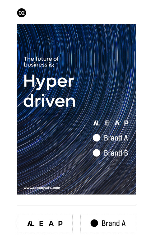
When partner brands are used with equal weighting, the Leap brandmark should be matching the size and hierarchy of the partner brands.
Either the primary or secondary brandmark can be used here. It is recommended the version used is selected dependant on which version provides the greatest prominence together with the selected format of the partner brand logos - and provides a balanced hierarchy across the communication.
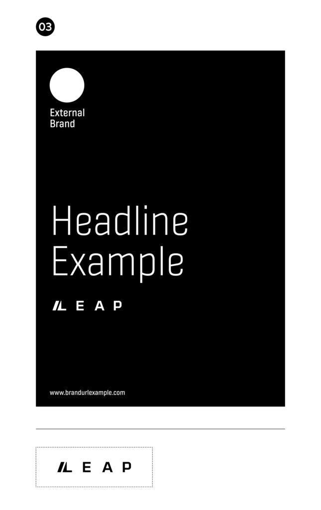
When the Leap brand is featured in partner communications and marketing material, the secondary brandmark should be used.
Colour Palette
The following is the brand colour palette for Leap and a guide to the ratio of colours that can be used across brand application. The ratios should be followed closely amongst the entirety of an individual application. Judgement should be used when additional impact or differentiation is required within an individual screen or section of a communication.
Rollover and click to download Adobe Illustrator Swatch File.
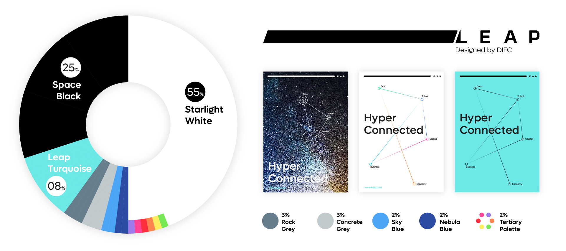
Primary Palette
Space Black
#0a0a0a
C 30. M 00. Y 00. K 100
Black C
Leap Turquoise
#6ce8e7
C 71. M 00. Y 15. K 00
3155 C
Sirius White
#ffffff
C 00. M 00. Y 00. K 00
N/A
Denim Grey
#617f90
C 64. M 43. Y 30. K 25
5405 C
Stone Grey
#bfcacc
C 30. M 18. Y 15. K 03
428 C
Secondary Palette
Nebula Blue
#2b4ba3
C 90. M 68. Y 00. K 00
2726 C
Sky Blue
#4ba5f7
C 61. M 22. Y 00. K 00
212 C
Tertiary Palette
Sun Yellow
#fbed76
C 00. M 00. Y 68. K 00
101 C
Starburst Orange
#ee895b
C 00. M 51. Y 100. K 00
144 C
Red Giant
#ea4547
C 00. M 87. Y 85. K 00
1788 C
Virgo Pink
#ea5494
C 00. M 61. Y 06. K 00
211 C
Purple Night
#967ae3
C 44. M 70. Y 00. K 00
7441 C
Nebula Green
#93e36a
C 44. M 00. Y 86. K 00
7487 C
Typography
These are some examples of how the brand typography can be utilised within communications.
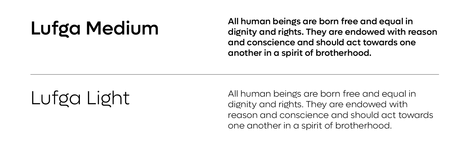
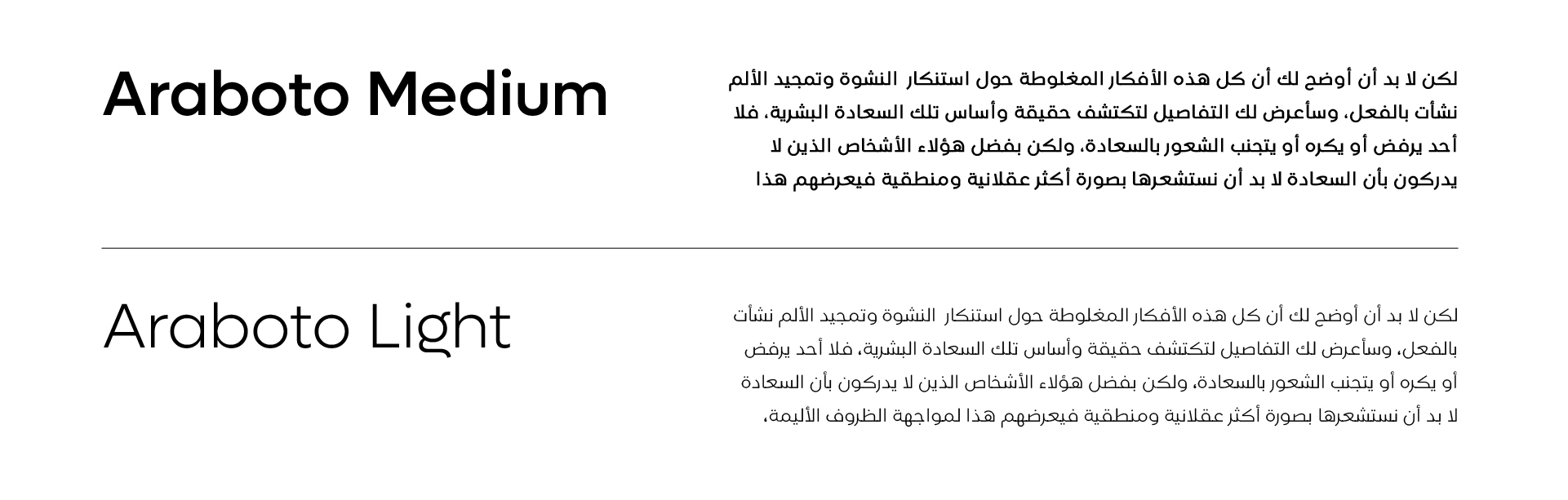
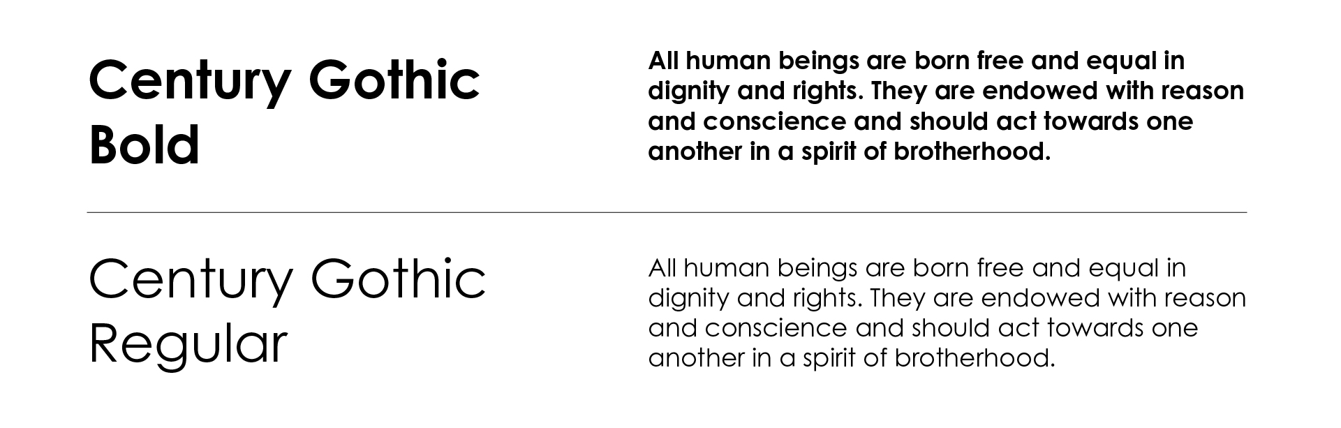
Typography should always be implemented in a clean and structured manner. Particular attention should be given to the weights used for body copy and headlines. Both Lufga and Araboto are available in multiple weights, and dependant on the use case – additional weights can be used if deemed necessary to create a greater hierarchy of information – for example in information graphics or illustrating abstract or complex business concepts.
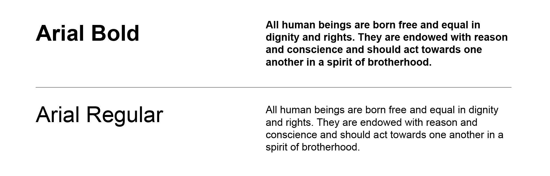
However as a general rule, the following weights should be primarily used. Note that digital and print use different weights. This ensures better clarity and better alignment of how fonts are viewed on screen vs printed on physical medium.
Latin Typeface: Digital
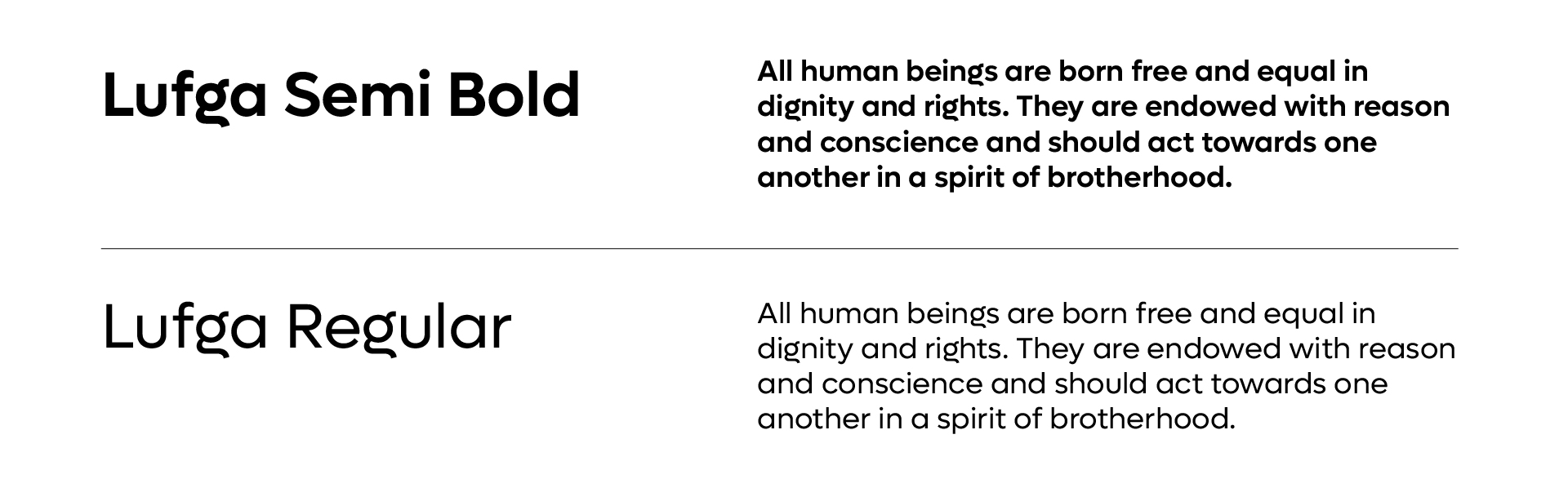
Latin Typeface: Print
Arabic Typeface: Digital
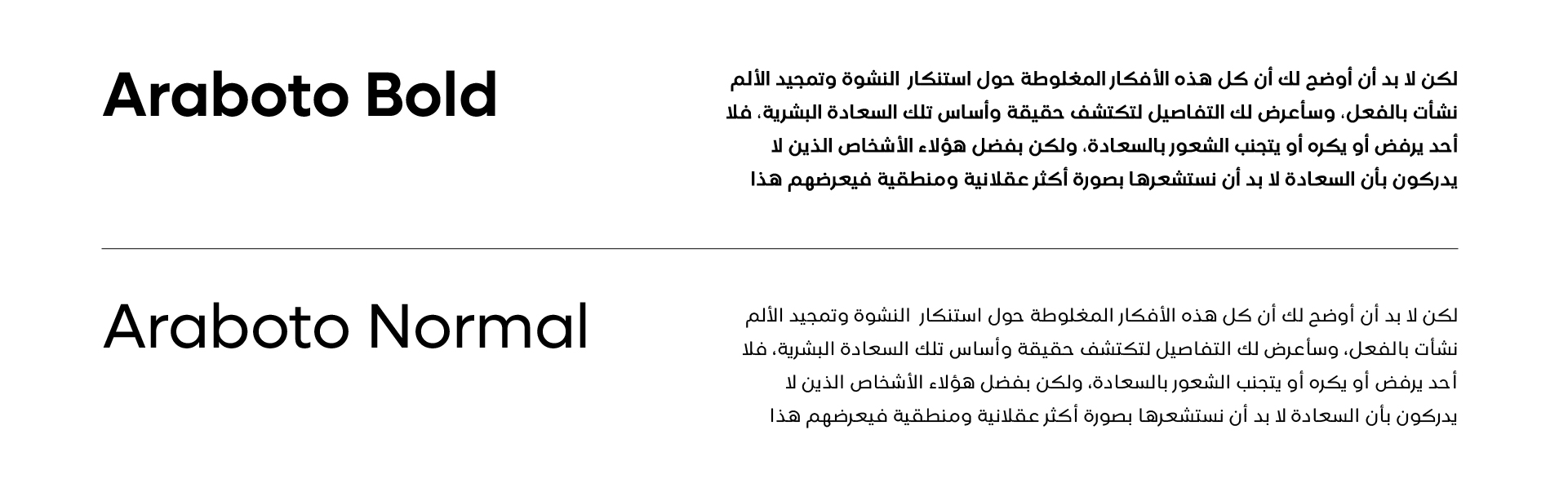
Arabic Typeface: Print
Websafe Type
Email only typeface
Typography Rules
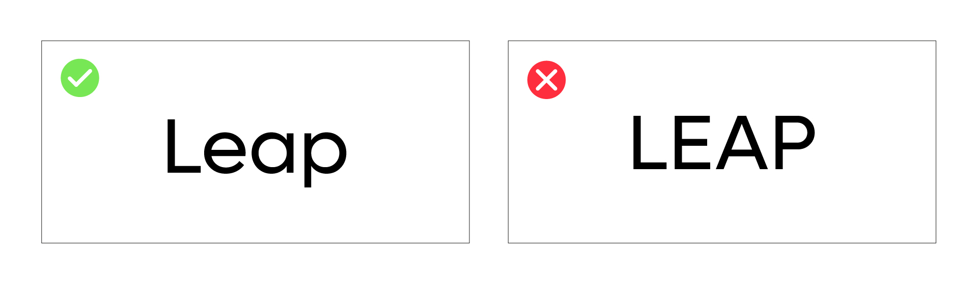
Typing Leap
It is important to remember that even though the Leap brandmark is in uppercase, it is essential to type Leap in Sentence case to ensure consistency across all mediums and platforms. There are a few reasons for this.
1. Sentence case is easier to read overall.
2. Sentence case creates a differentiation between DIFC and Leap – when written in body copy.
3. Leap in sentence case cannot be confused as being an acronym.
The following are examples of how Leap should be written within copy or set in applications.
Typography Alignment
We recommend typography is always aligned left whenever feasible. This ensures a consistent look throughout all applications and adopting an inherent design integrity across layouts for both digital and print.
Graphic Language
Graphic Style
The following is a breakdown of how and what is allowed to be created graphically for the Leap design language.
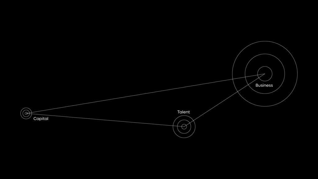
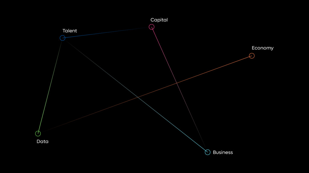
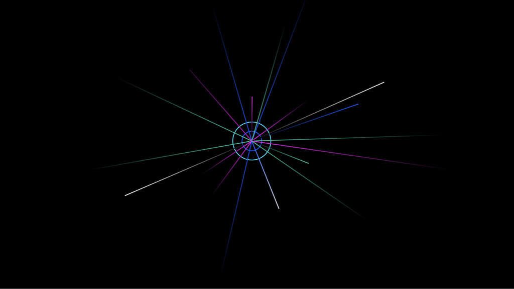
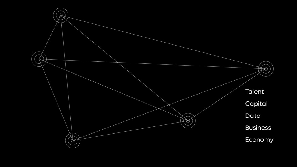
Core components: Illustration
The following are the basic core components for creating a graphic communication for Leap. Below are the basic forms that can be used individually or as a combination of multiple items to communicate an idea or enhance a brand message:
1. Straight line graphic
2. Circular node graphic
3. Concentric circles
4. Diamond shape
These elements should act as a starting point to create both simple and complex graphic illustrations that aid in representing both concepts and specific services. These illustrations should be used with restraint – primarily to be used within brand specific messaging across social media, and digital applications.


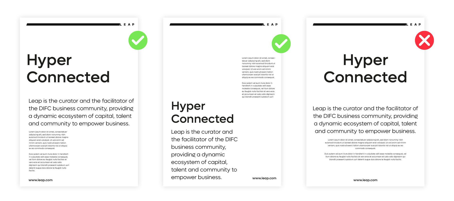
Examples of graphic illustrations
The following are a selection of examples going from something quite basic to illustrations that are a bit more complex.
Illustration Basic Rules
1. Can be in colour or black and white.
2. Can be combined with typography.
3. Should avoid creating any forms that are recognisable as an actual real world object.
4. Should be abstract in form but communicate the idea of Hyper Driven Business
Rollover and click to download graphic library
Rollover and click to download graphic library
Rollover and click to download graphic library
Rollover and click to download graphic library

Rollover and click to download graphic library

Rollover and click to download graphic library
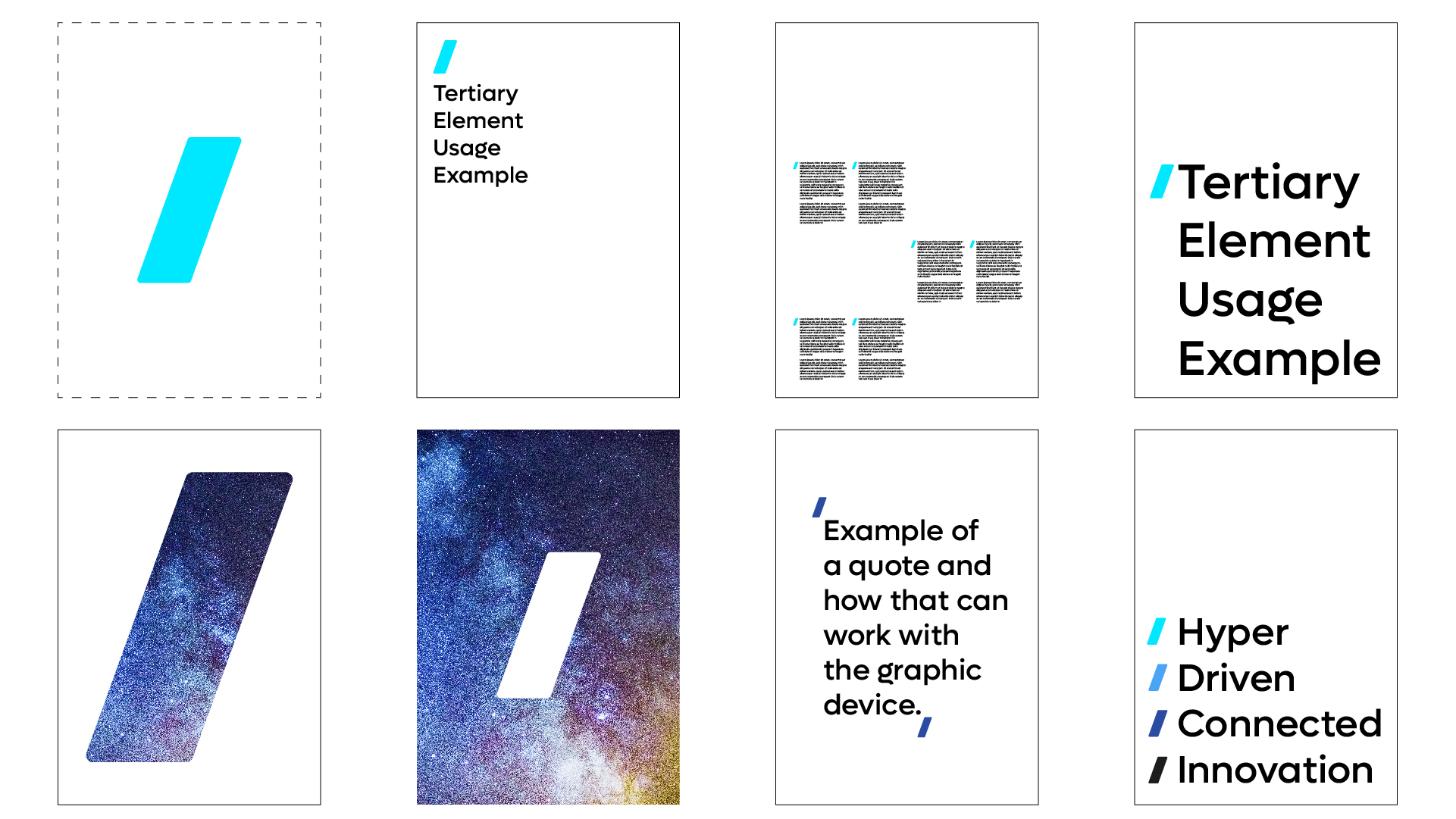
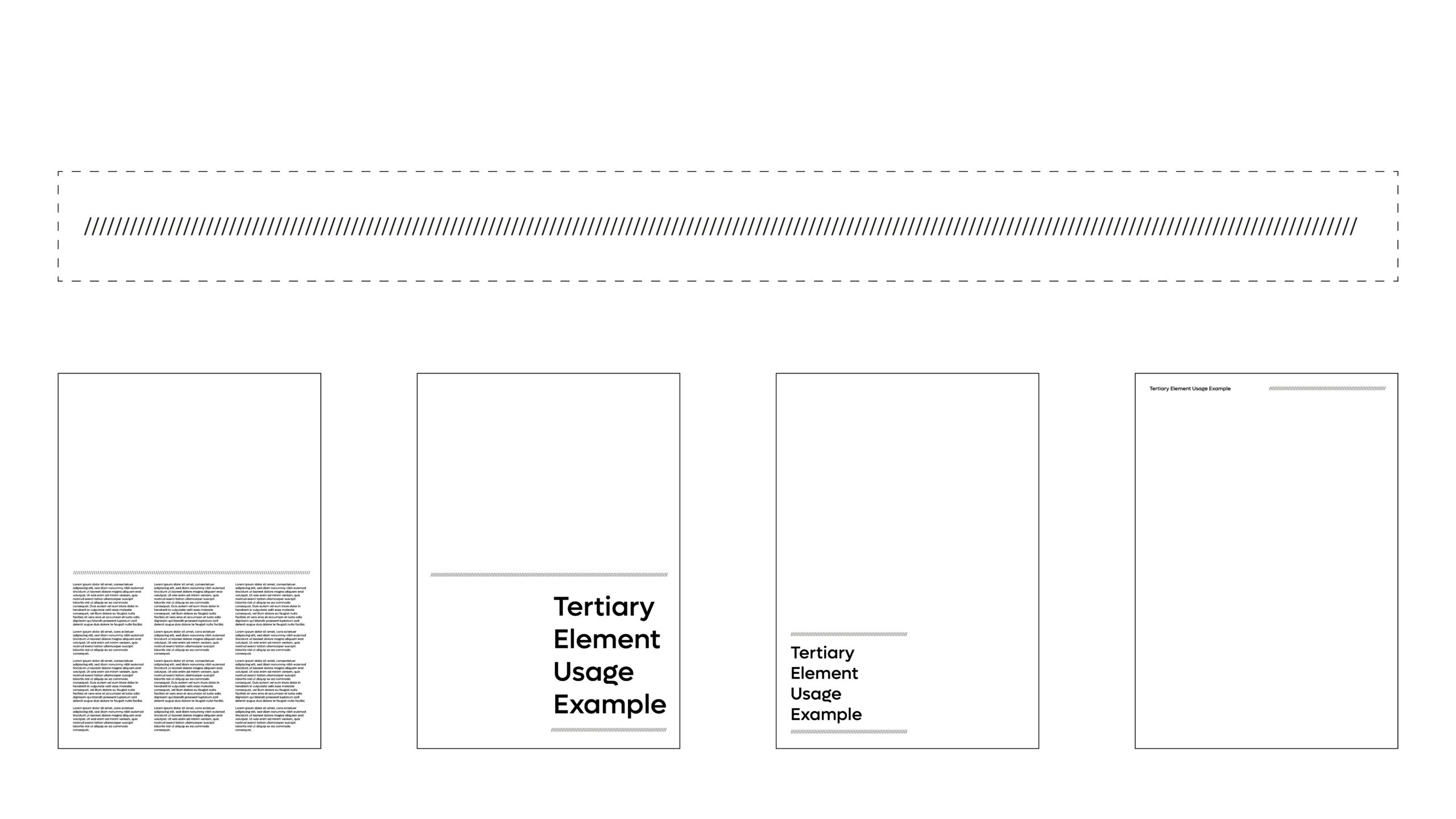
Tertiary Components: Start Forward Device
The Start Forward device should be used sparingly across communication. Use it as a device to indicate a category or subject matter, or to indicate a key message or headline, always being used in conjunction with typography or imagery or graphic content.
This device can be used independantly but should never become a primary element for the brand.
This device can be used as motion device across animations and marketing videos to reveal messaging and animate the appearance of typography across a screen.
What not to do.
This element should NEVER be used or recreated into a pattern.– Avoid using anything other than the primary colour palette in combination with device.– Avoid using this as a graphic component within the wider graphic language unless using it to indicate a message or typographic feature or information.
Rollover and click to download graphic device.
Usage Rules with typography
There are some core principles when using the Start Forward device.
- Ensure the correct sizing is utilised for when using with typography.
- Ensure the correct positioning and alignment is used in conjunction with the typography
- Avoid overusing the device across all comms.
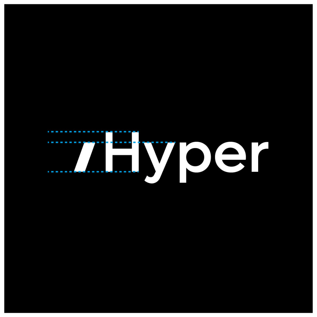
Primary sizing rule:
Size the Start Forward device at the same x-height of the typography.

Secondary sizing rule:
When using the Start Forward device with numerals - for example a date or event name that requires highlighting, use the cap-height to size the device.

Positioning rule 01:
When using the Start Forward device to bring attention to a heading or particular item of text, position the device above the copy, aligned left with the copy.

Positioning rule 02:
When using the Start Forward device in format of quote marks, utilise the same rule as above. The second Start Forward device should be aligned as shown, with the device aligned against the final upright/weight of the stroke - of the final type character.
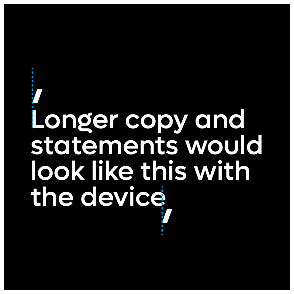
Example of how this would look with longer paragraphs of copy.
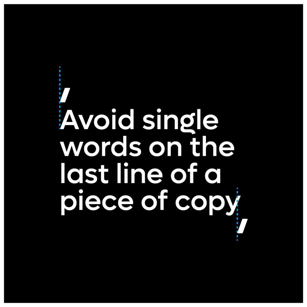
Avoid having single or short line length on the final line of the copy. This ensures the Start Forward device acts like a frame around the copy.
Tertiary Components: Break Device
The break device should be used to segment and create hierarchy across layouts to aid in communicating ideas and information clearly. This device is constructed using the same angle as used within the Leap brandmark. It should be used sparingly never more than twice within the same layout. This ensures the component remains a tertiary element, and does not become a dominant graphic device.
Should additional line breaks be required – for example in large information graphics or data sets, then its use can be expanded – HOWEVER care should be taken whereby primary information is highlighted or segmented using the break device, while secondary data or information utilising a standard horizontal line.
The weight of the break device should be limited to 1-2pts but can be adjusted for large format marketing collateral for example on outdoor screens or billboards.
Rollover and click to download break device.
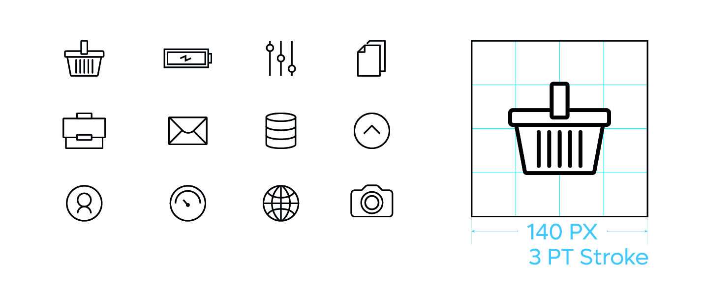
Tertiary Components: Icons
Iconography plays a tertiary role for the visual brand identity of Leap.
Iconography should NOT become a dominant component of the brand, only being used to enhance and aid the communication of an idea or subject matter and NEVER become the lead or primary element of a piece of communication.
The role of the icon should be limited to conveying information on sub-section or to simplify and add visual cues to a information graphic.
Shown here are a small set of icons – indicating the form and style that should be adopted.
Icons should have linear, geometric and minimal flat feel in design and use common used shapes and representations that are commonly known and understood.
The following are a selection of icons indicating the style and form that should be adopted for iconography used across all brand collateral.