
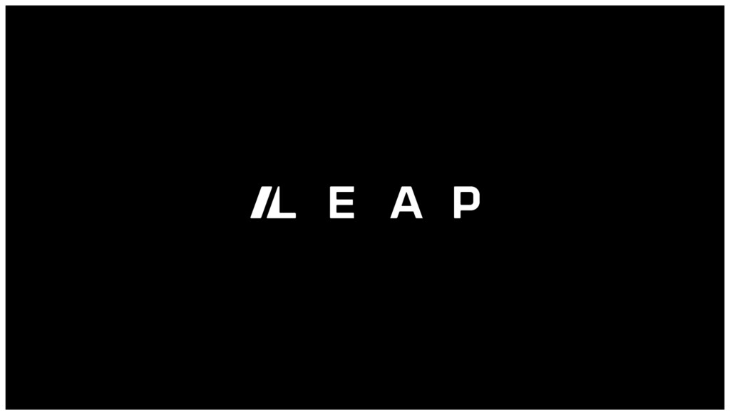
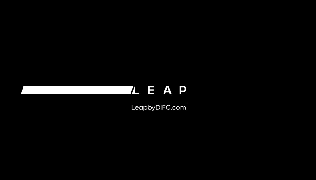
On introduction, the full Leap logo should appear. For long form content the full Leap wordmark should appear every minute, for short time.
Video + Audio
Video and Animation Components
The following are the approved animations for Leap Brandmark. Use these across all videos as required. Ensure the approved edits are used. Should you require shorter variants – please get prior approval from the brand agency before implementing new edits.
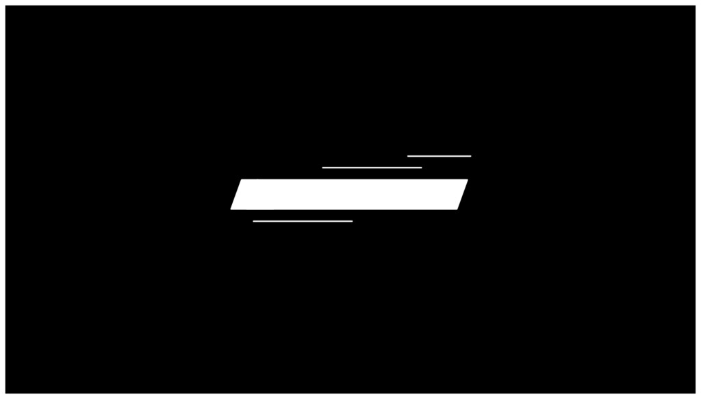
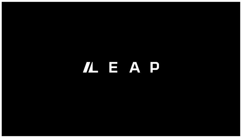
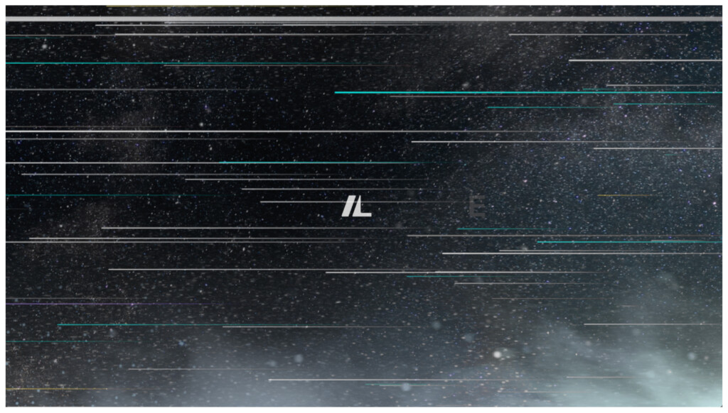
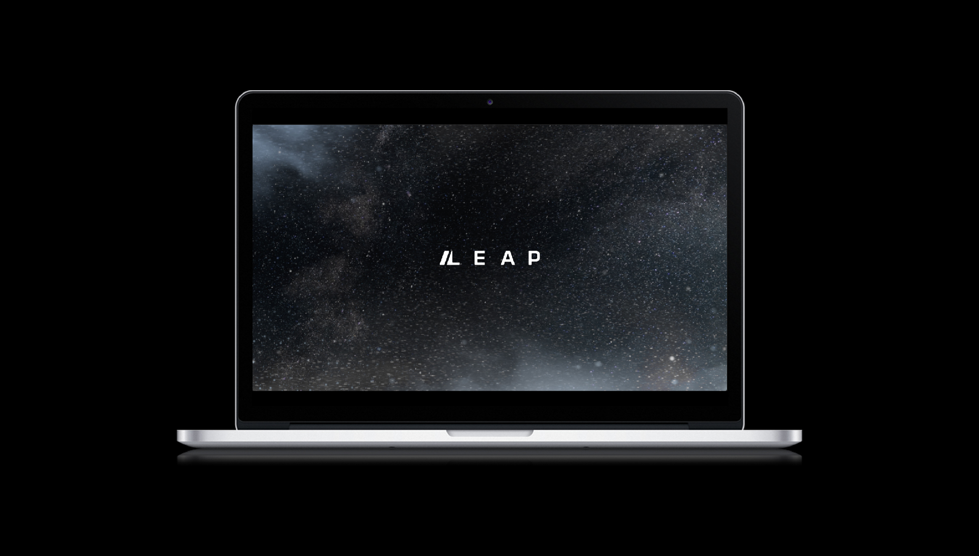
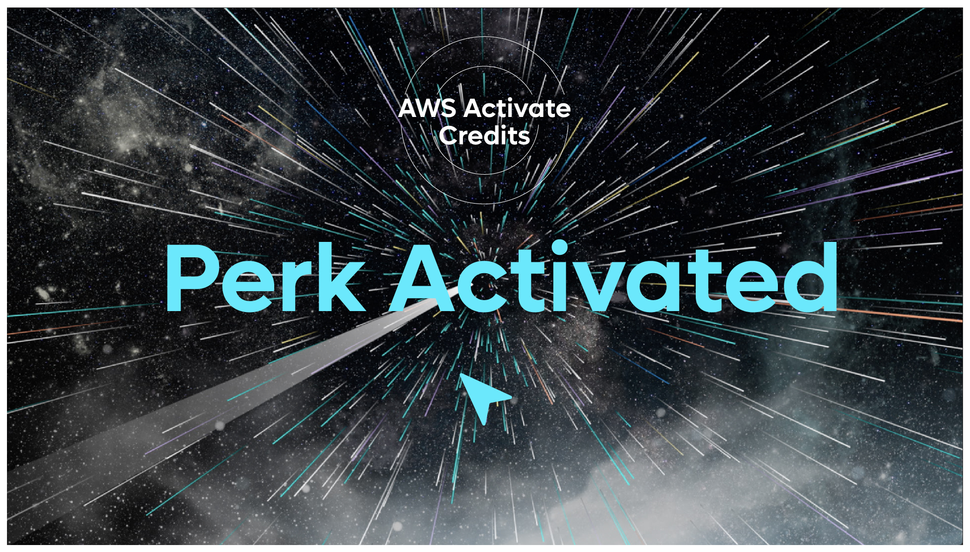
The following animation should be used when revealing Leap in a particular region, country or event. This is an introduction to Leap and the concept of Leap being a place for the hyper driven, hyper innovative, and hype connected.
There are two variants of this animation.
- Full Leap logo reveal
- Leap logo icon reveal only
Full Leap logo reveal
Leap logo icon reveal only
Leap Logo Loop
Use this for screensavers or on digital documents as a living logo.
Two formats:
1. White on Black (Preferred)
2. Black on White
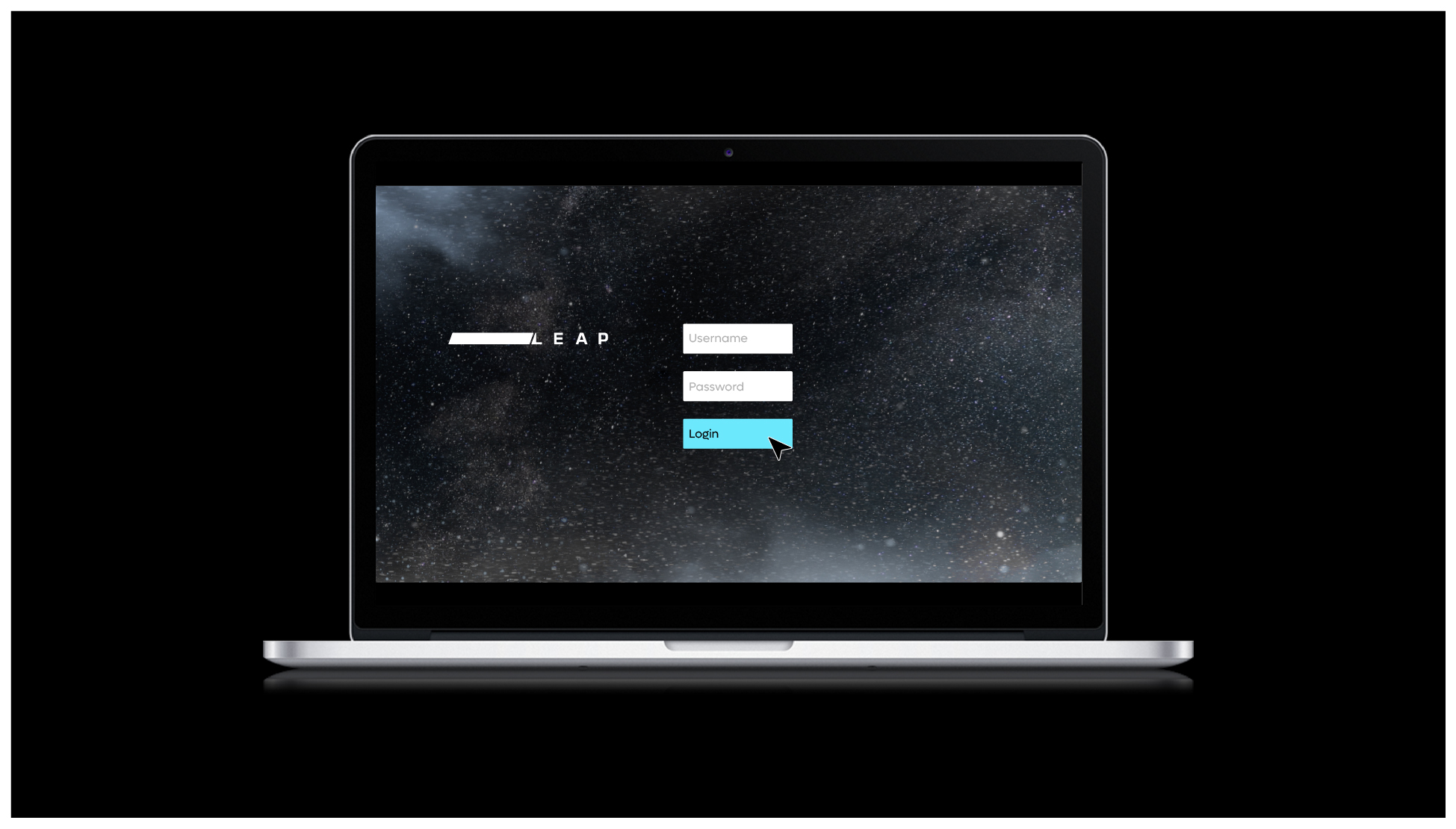
Video Intro and end screens
The following logo animation can be used as an intro to all video content:
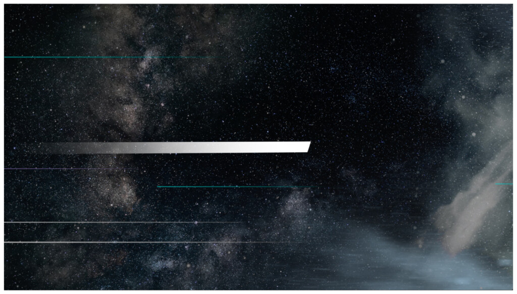
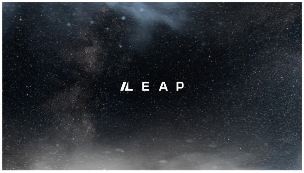
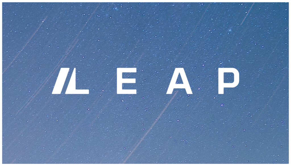
Dependant on the communication, we can use black backgrounds or light trails images. We suggest using the light trails backgrounds at the start, and ending with the black background or the full or partial logo animation – dependant on the duration allowed for each video.
Basic rules:
- Use the short form logo loop animation on light trails images
- Use the short form logo loop animation on a black background
- Use the full logo animation (long or short edit)


We recommend and suggest the following cut is taking when a shorter version of the logo animation is required.
00:16-00:22

Video Transitions
There are several transition techniques that are recommended for use across all video and motions content.
The decision on which technique to utilise and implement should be selected based upon the audience the video is being targeted to, and the type of content being communicated.
Default transition technique
On a very basic level only straight cut transitions should be implemented across different cuts of video.
The secondary level when creating more engaging or energetic content, the use of jump cuts, and crossfades can be used.
On a tertiary level when the content is looking to attract and engage the following transition should be used.
These should be used sparingly, and only on short form content – when there is communication that is looking to energise and activate an audience.
Use the following link to reference how to create these transitions.
https://www.youtube.com/watch?v=Fj7woohZ0is
Camera Lens Blur Transition (Footage or Graphic content)
See guide video: 05:15 – 05:53


Punch Zoom Transition
See guide video: 05:54 – 07:00


Whip pan transitions (Footage or Graphic content)
See guide video: 07:00 – 08:05


Titles and transitions
The following is examples of how titles and copy should be implemented across video.
The background these are implemented on can be video footage, or stills. Alternatively black background or light trail images can also be used.
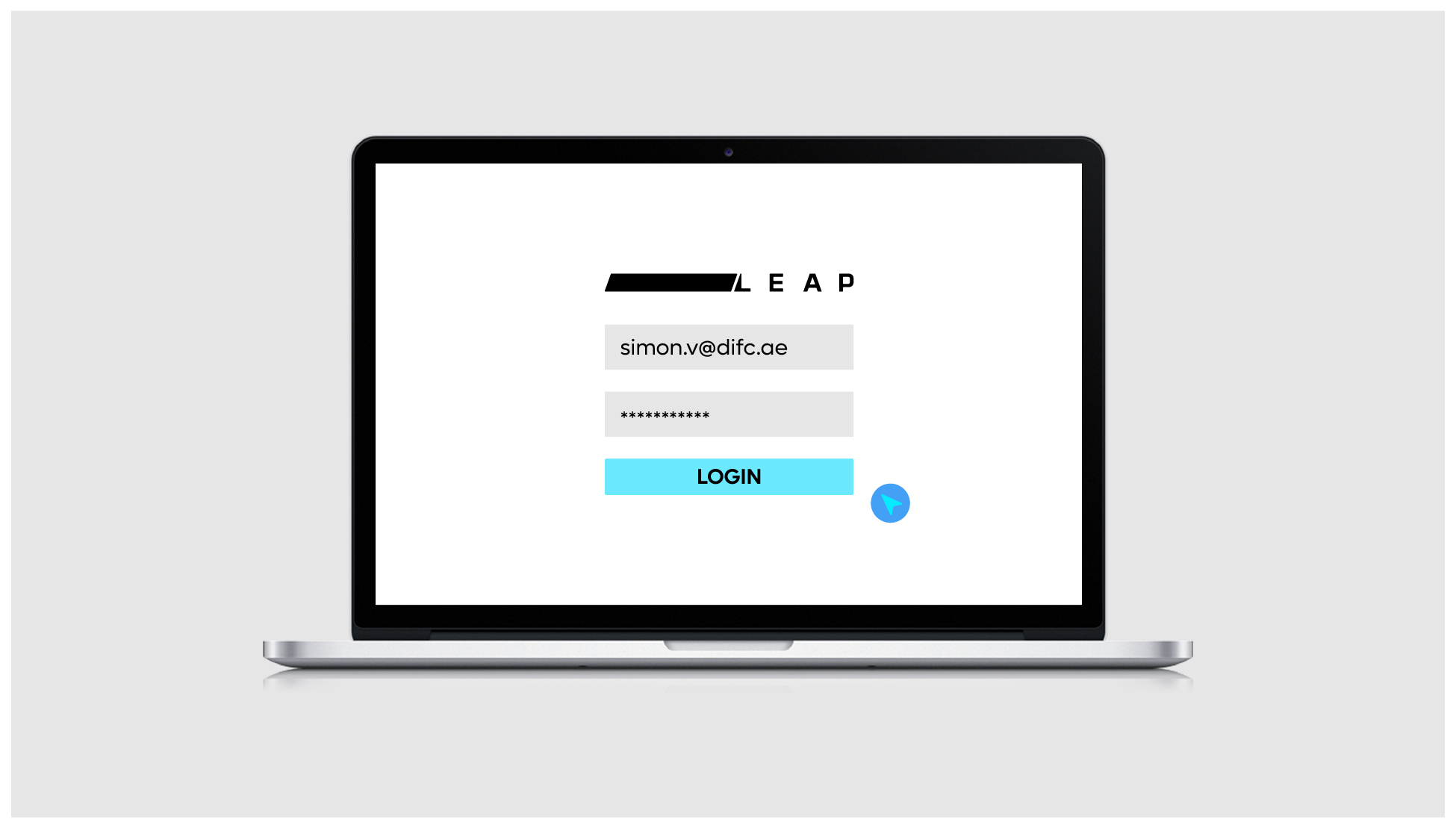
Supers and Overlays
For titles, names or snippets of information – the following layouts should be used.

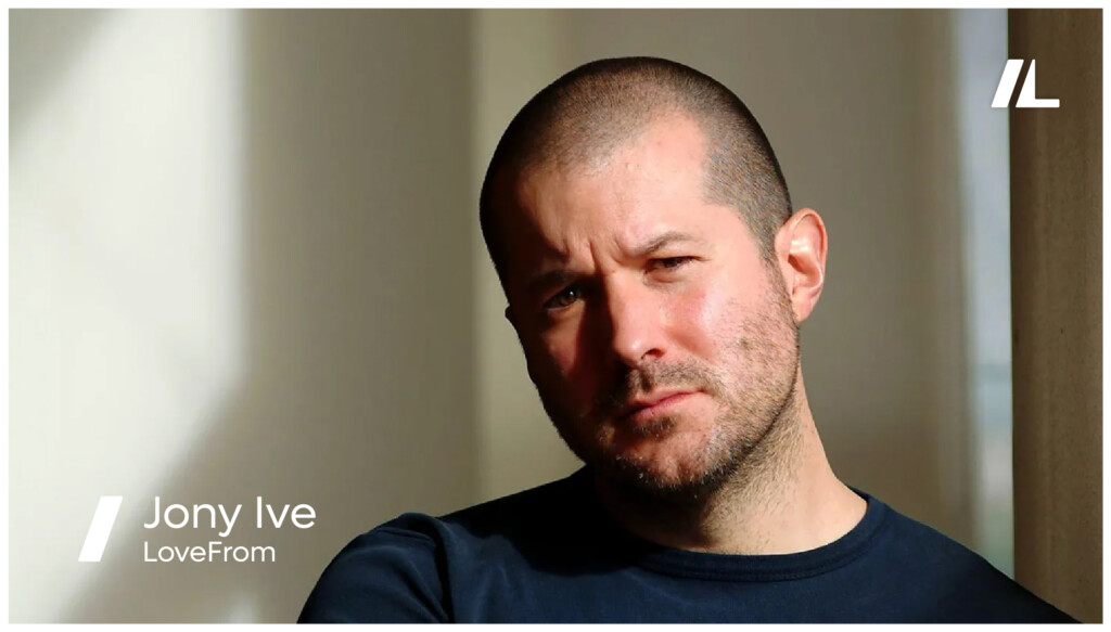
The Leap logo can then transform the icon after the first 5-10 seconds of an interview.
End frame screen
The following format should be used for static end frames across all videos – where the logo animation is not utilised.

Any light trails image background can be used.

This can also be the animated version of the light trails from the logo animation
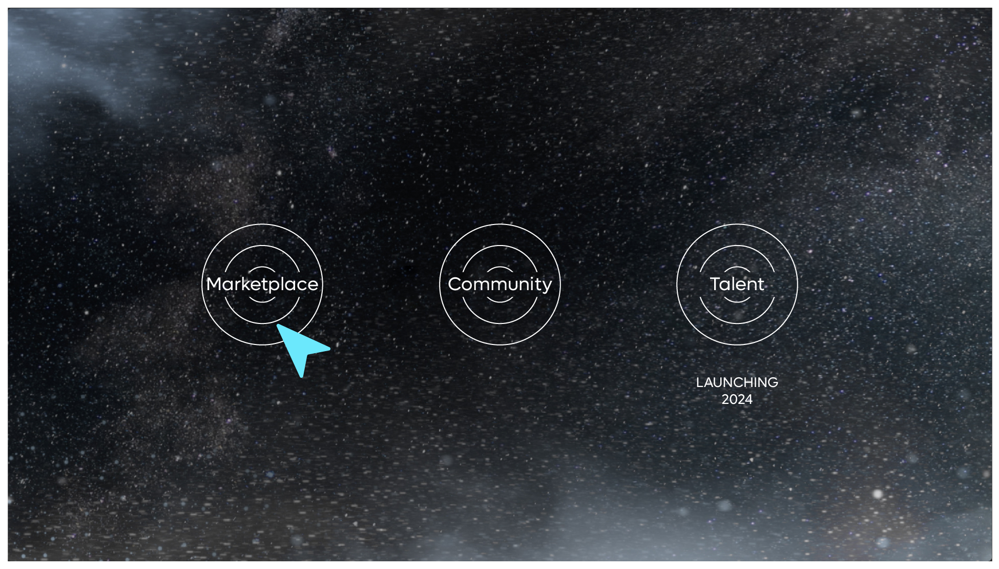
Brand video styling
The following are a selection of frames indicating the style and format for creating a walkthrough video of the platform.
It is important to note that walkthrough videos aren’t just simply a screen recording of the actual use of the platform – but rather a more stylised, focussed highlighting of the key features of the platform.
Below are some examples highlighting the key features of the platform.
Please note the backgrounds used can be any of the light trail images that feels suitable for use, however the same consistent image should be used throughout the walkthrough videos.
Basic platform features
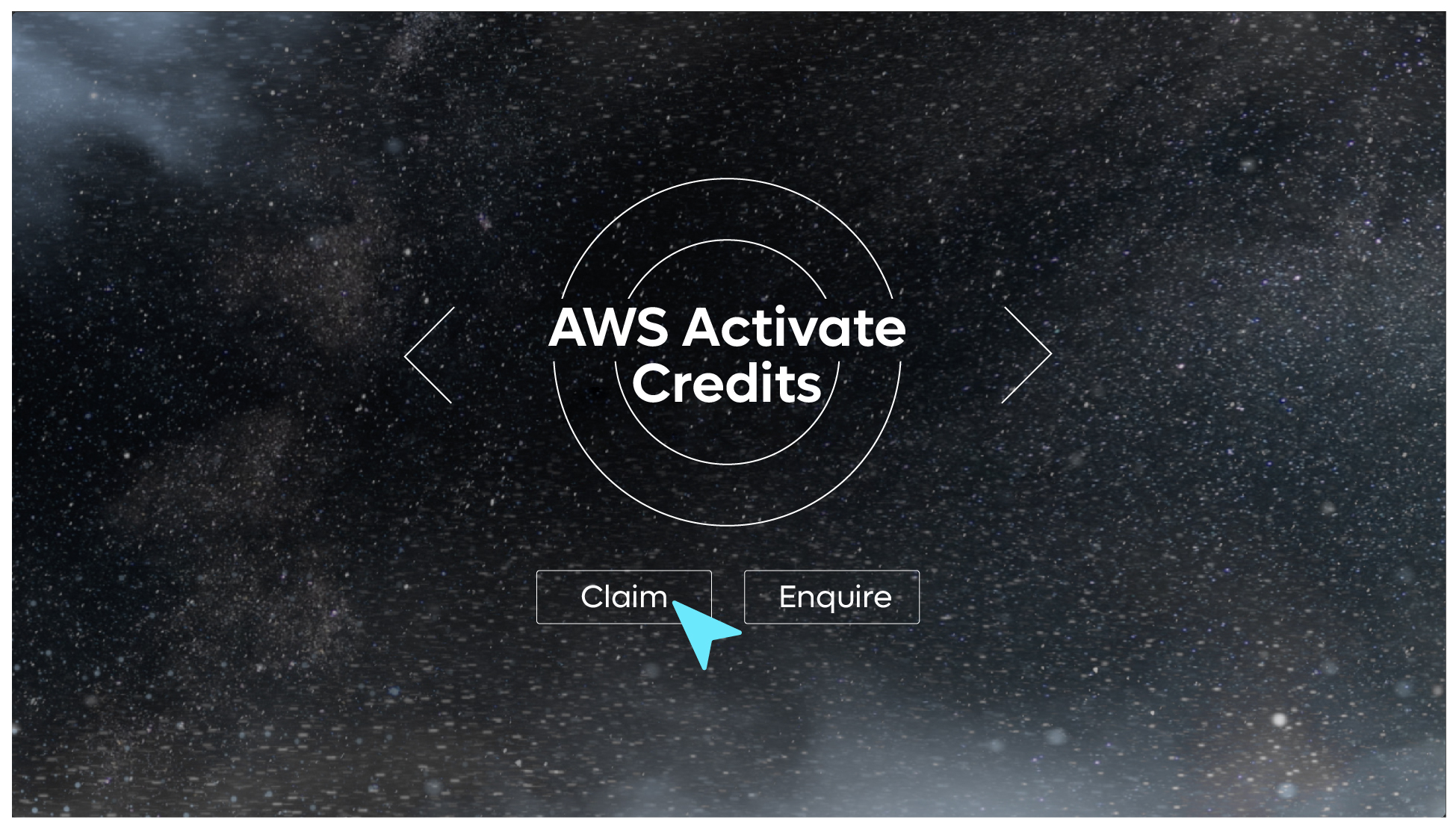
The following are examples of how a stylised video would work when introducing or summarising the core features of platform.


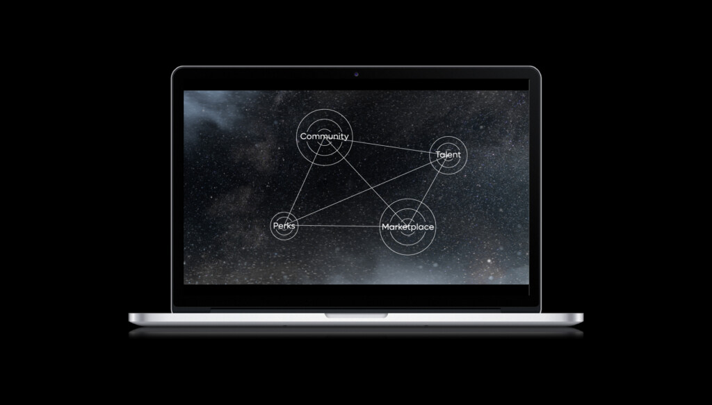

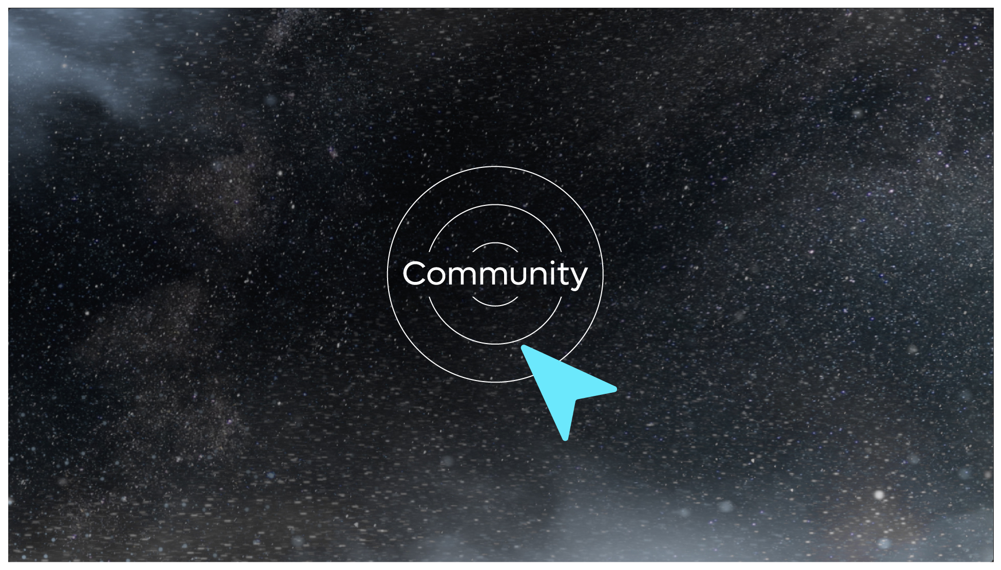
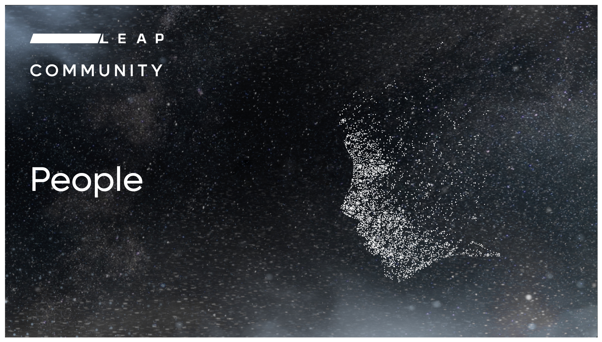
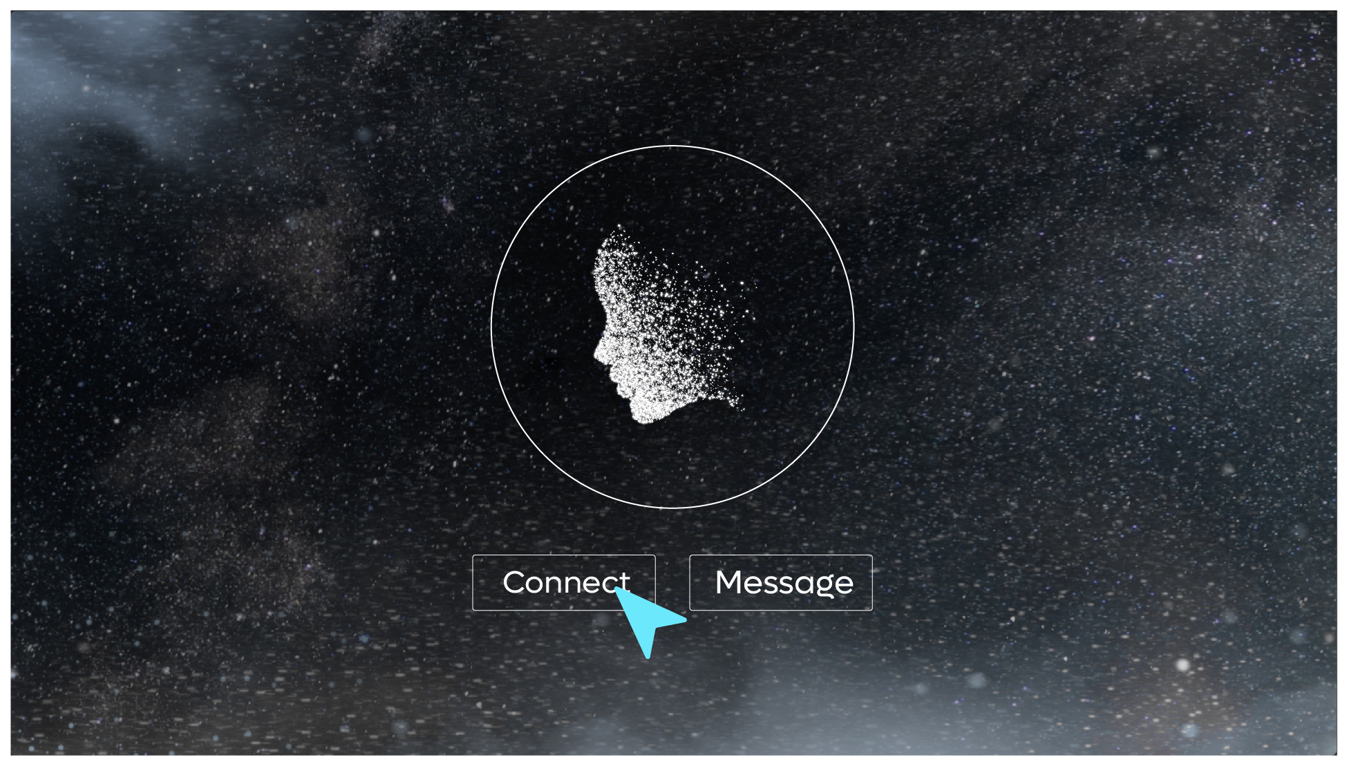
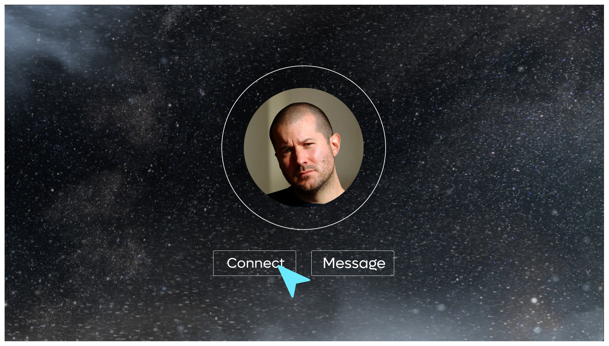
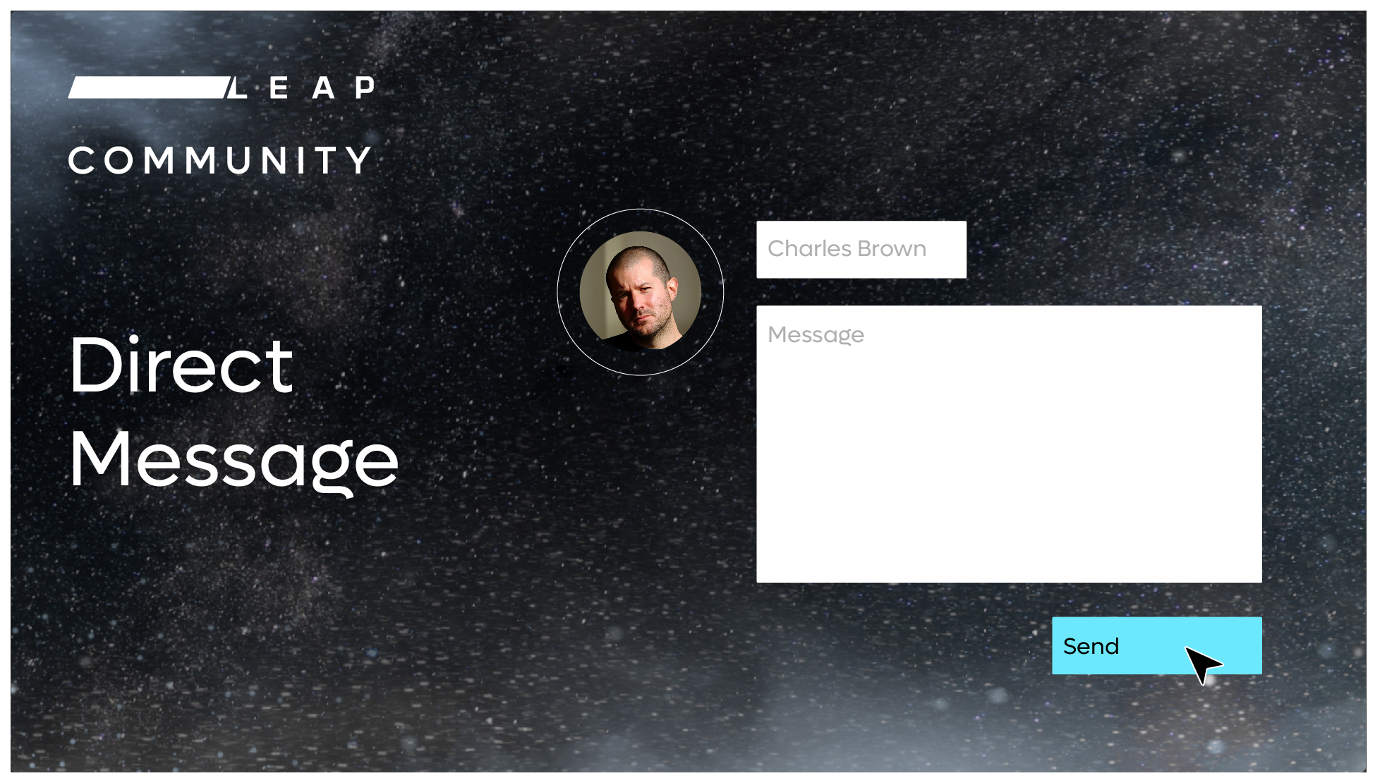
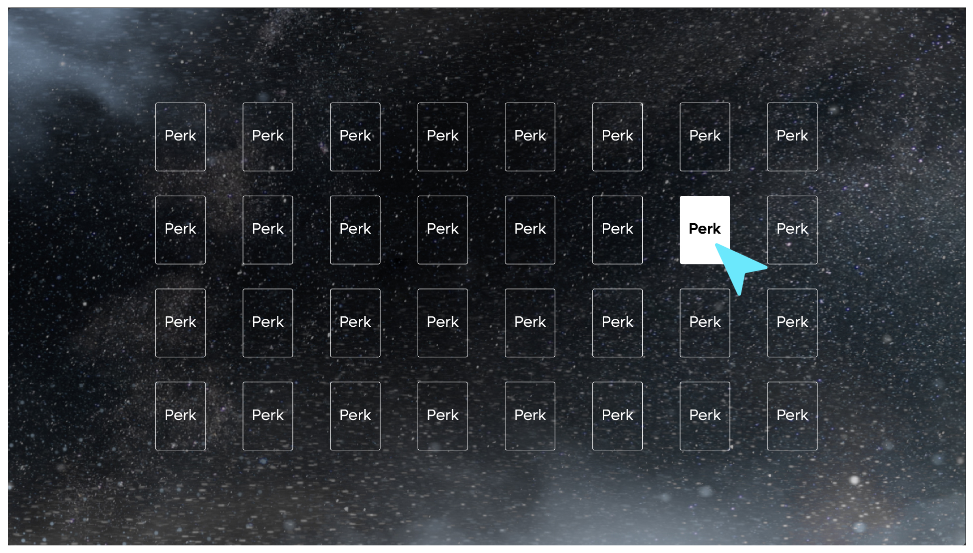
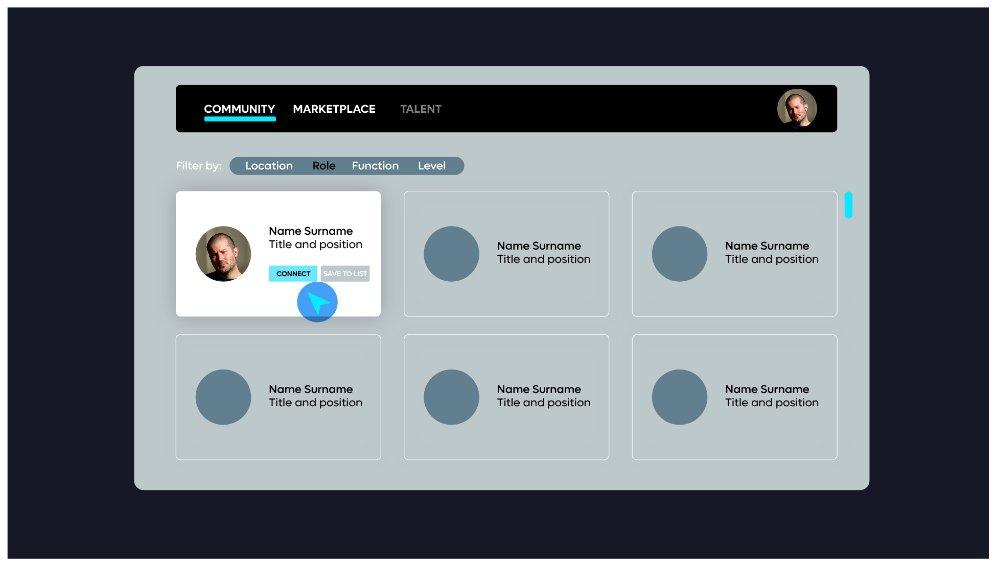
Community
The following are examples of how the Community features can be visualised within the walkthrough.
It is not a requirement to show the laptop on screen – however we would suggest that the walkthrough should start with the laptop to give context to the platform. The screen can then be zoomed into as needed to focus on the features and functionality.


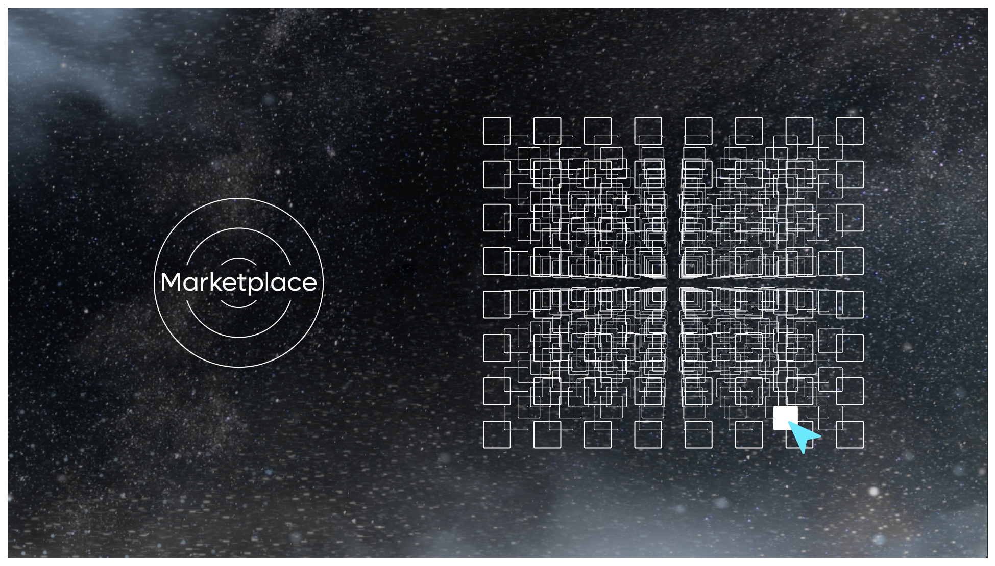
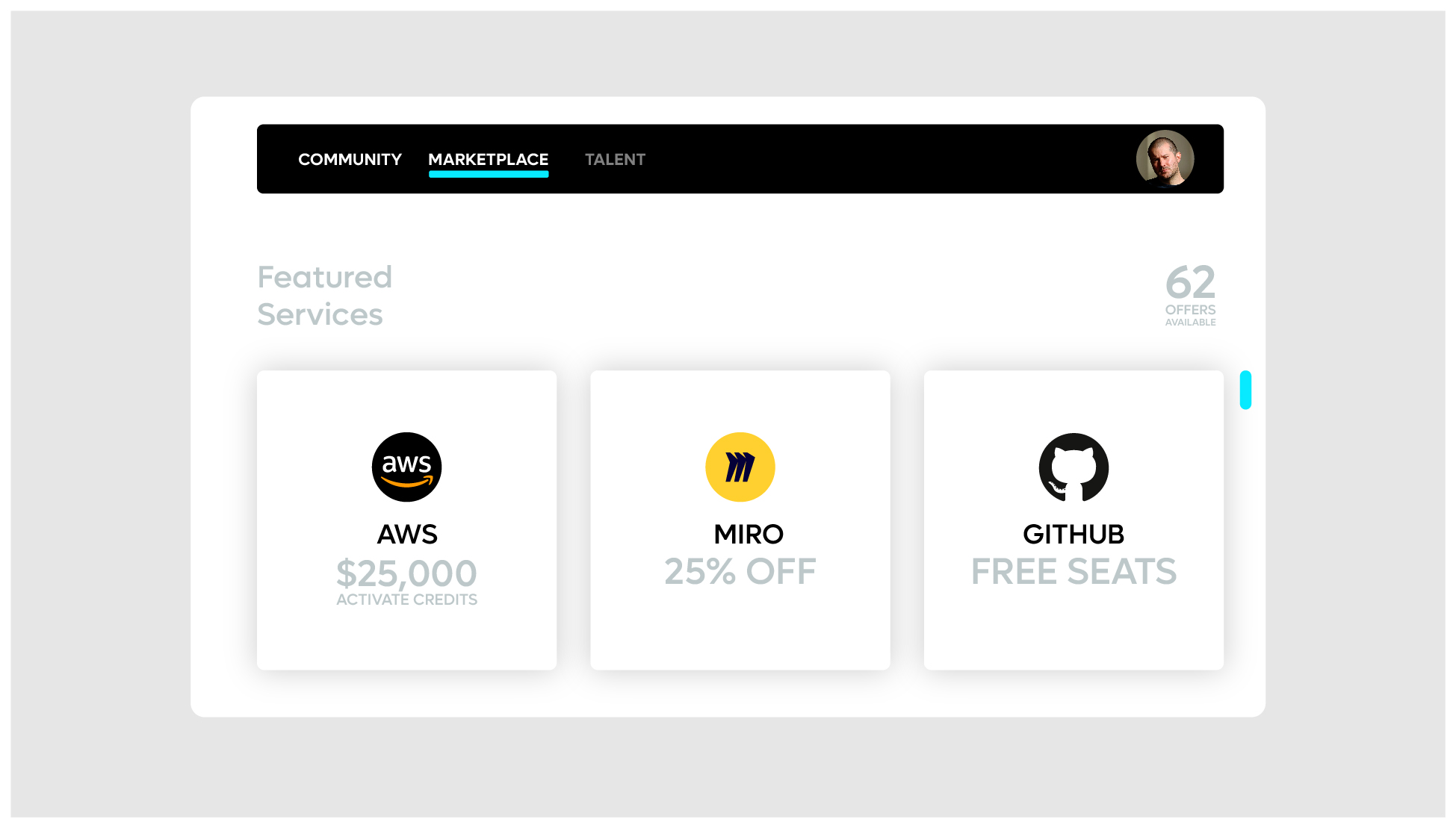
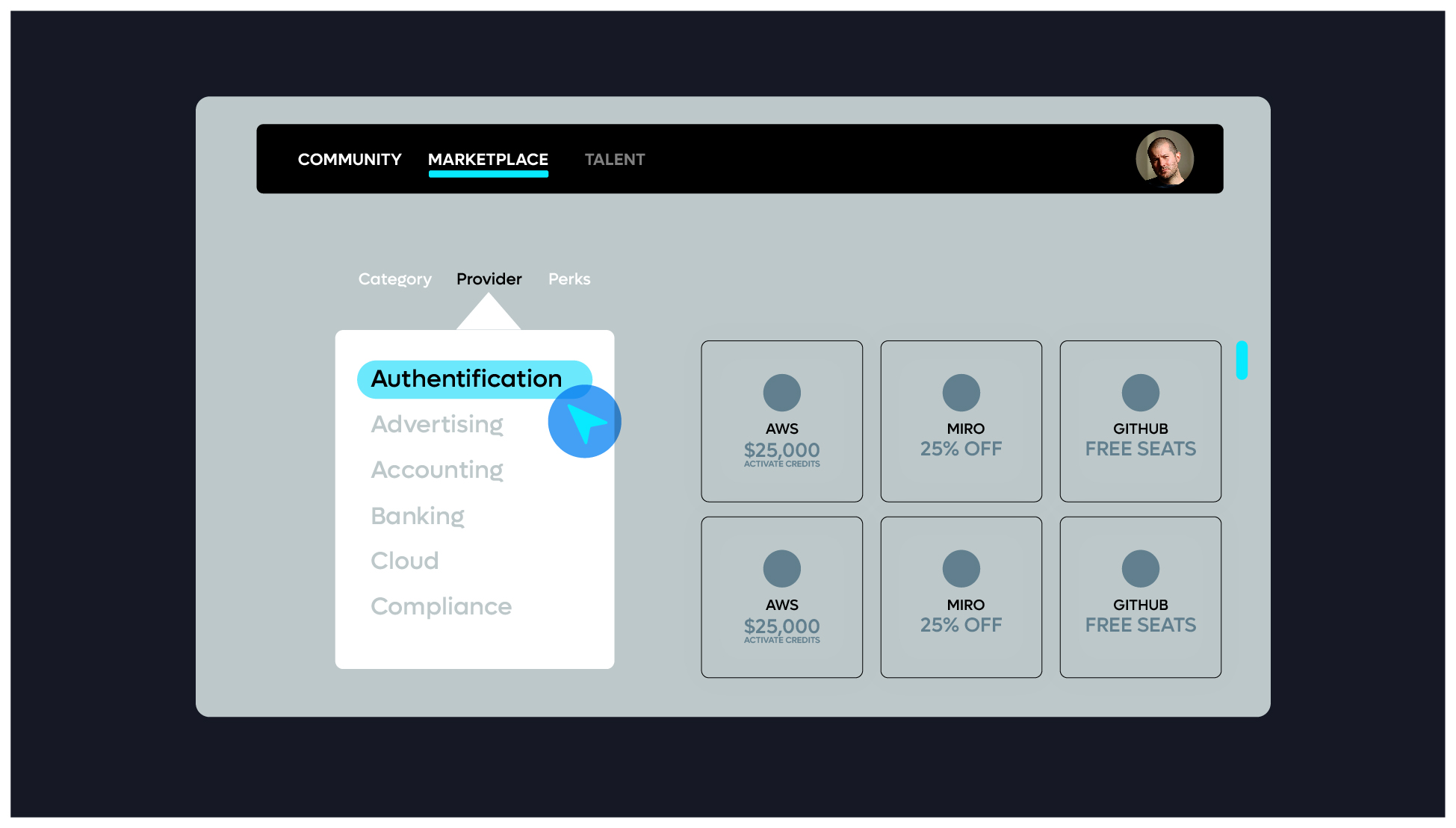
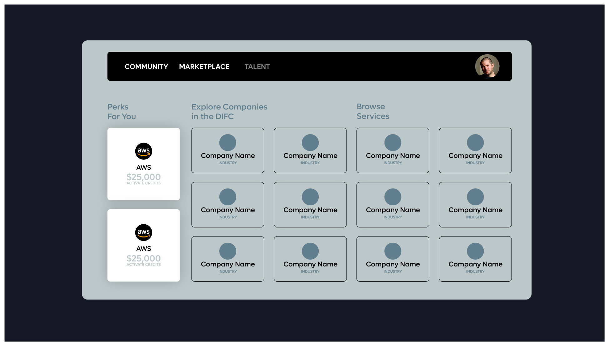
Marketplace

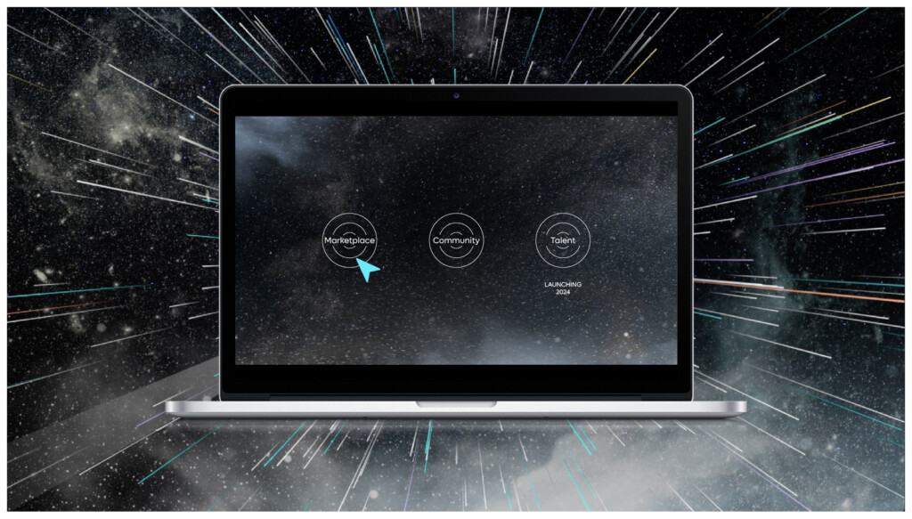
Walkthrough styling video
The following are examples of how a walkthrough video should be styled.
This styling should only be used in an instructional video space – whereby we are simplifying the platform by removing unnecessary content, in turn highlighting the key features of the platform.
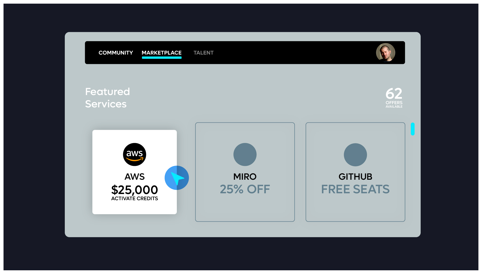
Instructional video should give user the context of where the platform lives, starting off by showing the platform on a laptop screen – but zooming into the screen upon login.
The zoomed in view should be the primary viewpoint – showing the key features with a voice over as required.
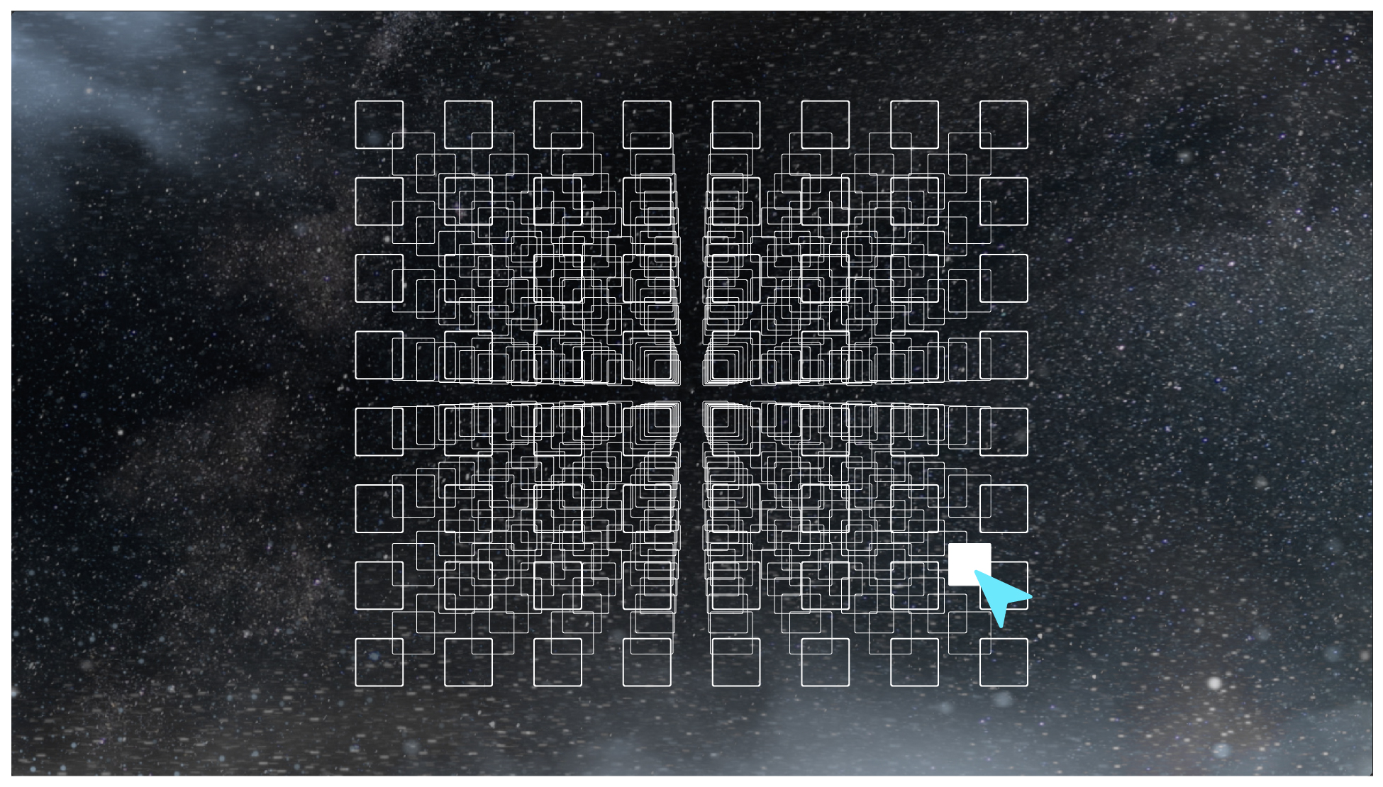
We should additionally highlight functions as the animation walks through the functional aspects of the platform through the dimming down of components not being interacted with.


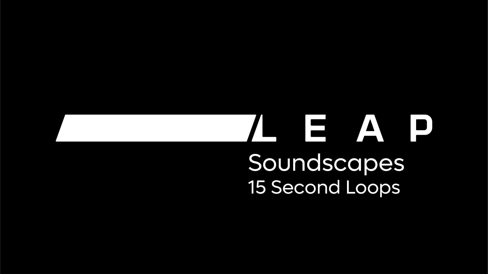
Audio and Soundscape Components
The following is the approved soundscape for the Leap brand. Use this across all videos using the pre-edited files available as variety of durations listed below.
If additional lengths are required, please ensure they utilise the approved sound files to build a longer or shorter duration file.

